Problem: It is extremely cumbersome to find out who wrote a specific part of the article, get an overview of how the current content maps to the various authors etc. History search based tools like WikiBlame make it merely very cumbersome. Who Wrote That? is a tool that provides a decent experience, but it is only available at a select few large Wikipedias.
Proposed solution: Extend Who Wrote That? to more wikis.
Who would benefit: Editors who need to track down problematic (or particularly excellent) content, wiki historians, researchers, readers suspicious about the reliability of a page etc.
Personally I mainly care about huwiki, but the more, the merrier; I assume it makes more sense to do this in bigger blocks; whatever the team feels is achievable. (Eventually, would be nice to extend it to all Wikimedia wikis, except for Wikidata and Commons which are quite large and non-text based so that would be a waste of resources. Enwiki is about half of all wiki content and I imagine the resource cost for a tool like this scales superlinearly, so that doesn't seem like such a tall order.) --Tgr (talk) 08:18, 5 February 2023 (UTC)[reply]
Thanks for creating this proposal! I believe we're going to address this eventually anyway (at least for a few other popular languages), but with a proper proposal that hopefully does well in voting, it will make it much easier to prioritize, acquire funding if necessary, and so forth. If it means anything to voters, the system that powers Who Wrote That? is WikiWho. The algorithm works amazingly well, but it's very costly as it essentially processes and stores data on every single mainspace revision (i.e. the full history of pages). I think adding many of the popular languages won't be a problem. Doing every single wiki (except Commons/Wikidata) is probably not going to happen anytime soon. I think we'd need to first revise the architecture, do a proper production deployment, and go from there. The storage footprint is currently just too great (for context, the combined size of the currently supported languages is about 3.8TB). It would probably need a dedicated team working on it for a year or more. MusikAnimal (WMF) (talk) 03:29, 6 February 2023 (UTC)[reply]
It would be very nice to have docker/script image or something which user could just git clone from repository and it would download backup dump of the selected wiki from dumps.wikimedia.org, process it and then download and process new revisions using API to keep it sync to latest version. This would allow hackers from different language versions to test and dev it locally (and and run their own annotation servers if there is more wide interest) Zache (talk) 05:34, 19 February 2023 (UTC)[reply]
Voting
Support This tool has become invaluable to me. Whether it is to track sources that used to be in the text (but were moved), to figure out when text was inserted to find if there was simultaneous discussion and to remove text by disruptive editors.. Femke (talk) 19:01, 10 February 2023 (UTC)[reply]
Support As a user who often sees who is editing and adding content to certain articles, this would certainly be of great help. Unfortunately, this is not yet available on the Indonesian Wikipedia. ···🌸Rachmat04·☕10:08, 14 February 2023 (UTC)[reply]
Very strong support This can help track vandalism more easily on more sites, and it can find good talent. I love this proposal. NPRB (talk) 14:27, 14 February 2023 (UTC)[reply]
Problem: Often times closely related projects might have very different pages on a topic which might appeal to different readers. These readers don't know that this other page exists as an option.
Proposed solution: Allow projects to define a sister project (e.g. Simple English Wikipedia for English Wikipedia) and if there is an article on the sister project display a button to allow them to click to the sister project page
Who would benefit: Readers who wish to try different versions to find the best one for them
More comments: Besides the Simple/non-simple example I gave, I could also see projects that have a very close language equivalent choosing to enable this option for their readers.
Problem: Wikipedia's bright themes/skins are difficult on reader's eyes. Vector 2022 is live and both readers and editors alike are ready for a true dark/night mode, like the one already supported in the native iOS/Android apps, and joining the most popular websites, web browsers, and operating systems that offer built-in support without hacks or workarounds.
Who would benefit: The average reader. This would also contribute to site accessibility and user energy savings (on OLED screens) and is already supported in the native iOS/Android Wikipedia apps.
More comments: This could be the year! This feature was previously blocked by the Desktop Improvements project, but can now proceed as directed by the Web team, built initially for logged-in users (see discussion below). In a previous update, that they stated it "would require significant work with the communities". Well this is the Community Wishlist Survey and we're ready for it!
This request was ranked among the top wishes of 2022 (if it wasn't kept in a separate category) and was ranked #2 in 2019.
I'm definitely in favour of this proposal, too. I'm aware that this will involve a massive conversion and testing of all the templates used on Wikipedia and other projects (including infoboxes, tables, charts etc.) to support, look good and be readable in both modes, and a lot of effort (and some discussion about some design choices) will be needed, but the community and the development team could work together on this for as long as necessary. --Lion-hearted85 (talk) 22:32, 23 January 2023 (UTC)[reply]
It's rather conditional, but if another team is already doing to have to crack the problem for the Vector2022 work, then darkmode should be hanging off its shoulder, implemented 0.4 seconds after it's in place. Darkmode is the work that WMF and Community alike have been freely in lockstep agreeing that we desperately need one and only one big technical blocker prevents it. DI reckoned they'd know if their fix would be possible by the time we head to voting, so we should know well before community tech has to make their judgement if we can progress further. Personally, if we are going to have a darkmode, a palate akin to Discord's would be great - but that's one for later! Nosebagbear (talk) 22:56, 23 January 2023 (UTC)[reply]
Support for this proposal; I'd like to look up the origins of the humble creme bruleé at 1am without blasting my eyeballs with a white text background. It would be a lot of work, but good god I think we'd all throw a party if it was implemented.Ineffablebookkeeper (talk) 23:15, 23 January 2023 (UTC)[reply]
"Well duh obviously" I thought when reading this, but then I realized that this proposal seems to have an assumption built-in that is yet unmentioned: that we would be able to toggle between dark and light modes. So thanks for bringing it up! I definitely support a dark mode that allows the users (accounts and IPs) to apply on the fly. — Mignof (talk | contribs) 02:57, 24 January 2023 (UTC)[reply]
Support: i want to save my eyes to be honest but just make it a little greyer would be nice. 02:25, 24 January 2023 (UTC)
Yes, please! Honestly, even a random inversion filter of everything but images would already be a major improvement. And please, please, please, make it CSS-only, following the "prefers-color-scheme" information --Tfardet (talk) 06:41, 24 January 2023 (UTC)[reply]
FYI, there is already a Gadget for that available on en.wp (and available to each other wiki that wants to install it) that does exactly that ? — The preceding unsigned comment was added by TheDJ (talk) 11:05, 24 January 2023 (UTC)[reply]
Strong agree. The brightness of the standard browser page and the style of the existing dark mode gadget have both triggered migraines for me in the past, limiting the contributions I can make. DJ Cane (talk) 08:49, 24 January 2023 (UTC)[reply]
Strong support, the gadget isn't actually a darkmode but simply just a color inverter which, in my opinion, is just a lazy way of doing it. Rather than putting in the effort to make a real darkmode it's basically jsut "You asked for a dark mode! This is a mdoe that's dark". We want a real dark mode, not a color inverter. ― Blaze WolfTalkBlaze Wolf#654513:38, 24 January 2023 (UTC)[reply]
For whatever reason I was never notified of this response Isn't it something to do with not having enough money supposedly? I'm not saying the team is being lazy, I just feel they could've put some more effort into it other than just making it a color inverter which some OSes come with as an option default (I know Windows 10 and Chrome OS both have color inverters default, don't know about other OSes). ― Blaze WolfTalkBlaze Wolf#654523:04, 10 February 2023 (UTC)[reply]
I definitely agree. An easy to find, user friendly dark mode should definately be implemented. I use dark mode through CSS but there should definitely be an implemented dark mode for the ones who don't want to fix with CSS and stuff and just want a dark mode to easily turn on for either reading or editing. Vidde09 (talk) 16:44, 24 January 2023 (UCT)
Yes, a dark mode feature is definitely a must, even when logged out. Only if the colors of the images don't go negative while loading, though. Lamp301 (talk) 05:27, 26 January 2023 (UTC)[reply]
Strong support. For a couple of months last year I suffered from photophobia, and had to set everything to dark mode to get any work done. A lot of migraine sufferers would appreciate this. Funcrunch (talk) 19:26, 30 January 2023 (UTC)[reply]
Having tried it a while back I thought perhaps I was remembering it poorly so loaded it back up for yesterday. Yes, I remember why I turned it off - it's very painful on the eyes, especially with blue/purple. I've also tried some of Giraffer's - which were less bad but still somewhat painful.
I don't know if dark mode layouts can be viably copyrighted, but if not, Discord's imo is the best I know. A mix of soft and mid-grays, slightly lighter blues. There's a reason that light-mode users on Discord are viewed as heretics[FBDB]Nosebagbear (talk) 09:31, 31 January 2023 (UTC)[reply]
I tried the gadget a while back and it resulted in flashing screen and it missed a lot of elements. For me the flashing was worse than working in light mode. Flounder ceo (talk) 16:35, 31 January 2023 (UTC)[reply]
I support dark mode. I think the quickest way to get there would be to allow mw:Skin:Citizen for logged-in users. This skin automatically detects browser preferences and engages dark mode. I have been using it on Encyc with very few problems. Flounder ceo (talk) 16:30, 31 January 2023 (UTC)[reply]
Hey everyone! Good news, we are going to move this proposal and let it into "Voting." We anticipate it will be very popular, given how popular it was last year as a Larger Suggestion. This being said, we want to set up expectations up front. The team implementing this wish will have to take complex considerations into account when they work on this previously "way too Large" wish. Pending the Voting results, the Web team has signed up for making dark mode available on beta, at the least. However, deploying a dark mode functionality the right way will be a multi-step process and a lot of the complexity arises when considering logged-out users. The initial release of the wish will not include logged-out users for this reason. Hope that adds visibility! Excited to see how this proposal scores in the Voting phase. Thank you all for engaging thoughtfully on potential avenues for deploying a dark mode to users. NRodriguez (WMF) (talk) 16:04, 7 February 2023 (UTC)[reply]
@Czar Do you mind if I reword your proposal to indicate that the Web team will be working on it? I just want to make sure expectations are clear when this goes into voting. Thanks, MusikAnimal (WMF) (talk) 18:23, 7 February 2023 (UTC)[reply]
I went ahead and made some changes. Hope this is okay! Note also again it sounds like only logged-in users will get dark mode, initially, in case we feel that should be explicit in the proposal. Thanks and regards, MusikAnimal (WMF) (talk) 01:27, 8 February 2023 (UTC)[reply]
Just make sure it is optional and not the default mode. Studies show that reading is harder in dark mode than light mode in general, and it's also much harder to read in dark mode when you have some vision issues like astygmatia.(talk) 13 February 2023
A good starting point will be https://commons.wikimedia.beta.wmflabs.org/wiki/Main_Page . Go to that site without logging in. Open the "Tools" drop-down menu > Click "Gadgets" > Click "Dark mode". This allows even anonymous users to use dark mode smoothly across pages. There is no white flash now, which was the case earlier on simply putting dark mode on sitewide js. Developers may use this as a template going forward. —(ping on reply)—CX Zoom (A/अ/অ) (let's talk|contribs) 11:58, 18 February 2023 (UTC)[reply]
Alternatively, the Android mobile app dark mode can be used as a template but I know very little about Android app and its feasibility to extend dark mode onto website. —(ping on reply)—CX Zoom (A/अ/অ) (let's talk|contribs) 12:02, 18 February 2023 (UTC)[reply]
CX Zoom, several technical users (and I think some WMF devs) have suggested this would result in a "cache split" where the servers would cache "with dark mode" versions of the every page/article. This would considerable increase server load and result in more cache misses, so the site would be slower for the end user sometimes as well. (but not nearly as slow as it would be if everyone created an account which would destroy Wikimedia overnight) prefers-color-scheme is technically the superior solution, but sadly not uniformly (or even easily in many cases) switchable for the end user. However, unlike for example ?uselang=de, I don't think ?withgadget= or ?withCSS= affect parser cache. There are some minor differences in the HTML outside the parser output, most notably the returnto parameter for the Special:CreateAccount link and the "mobile view" link in the footer, but I'd think (if that's part of any cache) that could be resolved differently. (either strip GET parameters from the returnto parameter and mobile view link or hack them in using JS when the link is actually clicked) But a WMF dev would have to comment on this, while I think it's technically possible to have this without a cache split, I don't know exactly how the caching mechanism works. Whatever the Android (or iOS) apps do can't be implemented on the website. The apps adjust things locally, on the device of the user. Extending this to the website would mean writing browser extensions for Chrome, Firefox, Edge, etc. that the user would have to install. — Alexis Jazz (talk or ping me) 14:44, 18 February 2023 (UTC)[reply]
Oppose This should not a priority to develop. A costly WMF development team should not spend a gross amount of time changing the colors of a website when they could instead be building tools that multiply the efforts of editors. If you want it this bad, learn how to add it yourself and submit a patch on Gerrit. Lectrician1 (talk) 22:22, 10 February 2023 (UTC)[reply]
Support This is a great idea and would make it a lot easier as the average reader most likely wouldn't know how to make a dark mode themself. ― Blaze WolfTalkBlaze Wolf#654523:06, 10 February 2023 (UTC)[reply]
Support While I wouldn't need it myself, this would be useful for many, not to mention the fact that wiki farms have this kind of thing already. We are behind. Firestar464 (talk) 01:11, 11 February 2023 (UTC)[reply]
Support Please for the love of everything, start on this already. It's been years. The longer this is put off, the longer it's going to take. I bet the horrid Vector 2022 skin would've been better received if it had been launched with dark/gray mode support. Veikk0.ma (talk) 22:32, 11 February 2023 (UTC)[reply]
Support Every big website has a darkmode, and many people work with darkmode, so we shouldn't scare people with pure brightness 958s (talk) 21:03, 18 February 2023 (UTC)[reply]
Support It would be useful for night owls and people who prefer darker color schemes in general, without the need to install third-party userstyles. Despair6610 (talk) 08:50, 19 February 2023 (UTC)[reply]
Support this should be implemented in all the wikipedia skins. (In ES-wiki we use the Vector legacy 2010 as default skin for users and non-users) Niskka2 (talk) 22:19, 19 February 2023 (UTC)[reply]
Support I think this is important not only because it is a oft requested feature, but also because it will require us to do more modernisation of our skin, which I think is important for the health of our platform. —TheDJ (talk • contribs) 13:11, 20 February 2023 (UTC)[reply]
Support Would be nice to have a default dark model on all platforms (browsers/mobile/etc). Using external style changers gives a bad experience for SVGs and certain kinds of transparent images, and supporting these out of the box would be great! Kyucasio (talk) 22:58, 20 February 2023 (UTC)[reply]
Oppose requires loads of work by communities to support it (transparent images, custom hardcoded colors) - there is no capacity for it and community tech will likely not fix articles. -- hgzh06:52, 23 February 2023 (UTC)[reply]
Would require some community work to make dark mode perfect, but we could easily have workarounds, eg. img{background: white}, which would be ugly but keep things readable in the meantime. SmallJarsWithGreenLabels (talk) 13:06, 24 February 2023 (UTC)[reply]
Strong support I know it's complicated to do, that suddenly some svg would be unreadable, but in this case I'm sure there is a way to modify the code of the svg file so that it becomes white when dark theme is enabled. I would also like the dark theme to be not necessarily black but dark gray (like the dark theme of the social network Discord), because it is more pleasing to the eye and less eye strain. Manjiro91💬12:31, 23 February 2023 (UTC)[reply]
Problem: Page preview windows are sometimes uncomfortable. A example is when you want to take a quick look over a list of links, let's say, a category page. While your common method of looking over the list is to move the cursor upward or downward, the page preview may cover the later links you have to check, so you need to move your cursor off the link where the preview popped up to make it dissapear and continue normally.
Proposed solution: Make a mobile page preview, so that when the cursor passes over it, makes it repel. In other words, make the preview detect in which way the cursor is moving to appear in the opposite side. That means you can never click on it? Yes. You have the link you've hovered over for it.
Who would benefit: Users who want to do quick checking of articles with no distractions.
More comments: A simple functionality for that specific situation can also be made.
Problem: Currently skins of Wikimedia wikis don't support responsive layout, dark mode and font size adjusting. We need a modern skin in Wikimedia wikis.
Proposed solution: Deploy mw:Skin:Citizen to Wikimedia wikis.
Who would benefit: Readers who want a better reading experience.
You have to register / log in to be able to select a non-default skin. Without a good way of communicating that to readers, there isn't much value in a reader-focused skin. --Tgr (talk)
Skin author here. I am not confident in my ability to maintain the skin up to WMF production standards by myself, due to the complexity and knowledge needed for the Wikimedia ecosystem (e.g. editor needs, extension support, etc.).
I agree with Tgr here, anon makes up the majority of readers and there isn't a user-friendly way to switch skins. The problem listed above is being tackled in other ways, such as Vector 2022. Skin is only part of the equation. Many content on WMF wikis are designed for Vector and sometimes for a specific scenario, implementing responsive layout, dark mode, and flexible font size would be a huge challenge as well. Alistair3149 (talk) 22:55, 14 February 2023 (UTC)[reply]
Oppose I went to the Citizen wiki from the linked page and immediatly saw text overlapping with UI buttons and checkboxes floating in weird places (firefox). This is clearly a half-baked skin. SmallJarsWithGreenLabels (talk) 22:13, 10 February 2023 (UTC)[reply]
Oppose Definitely not suited for the Wikimedia format. Maybe for video game wikis, but no, not here. Also, as TGR pointed out, implementing this would be ineffective regardless. --Firestar464 (talk) 01:09, 11 February 2023 (UTC)[reply]
Problem: It can be difficult to quickly find languages relevant to you from the list of language versions. The Compact Language Links feature is supposed to solve this, but ironically it makes it even more difficult so I've disabled it globally. Currently, there are three ways for a user to make specific languages appear in the abbreviated list. All have serious problems:
One way is to configure your browser's language preferences. But more often than not, the reason you want to see a page in a certain language isn't necessarily that you comprehend that language; it just means you suspect that language version might have information you're seeking that can be extracted even if you're not fluent in it. Not only that, just because you want to visit certain language versions of WMF projects doesn't mean you want to read other sites in those languages, let alone tell every website you visit that you understand them, which has serious privacy concerns because it enables them to fingerprint you more easily.
Another is to list languages in a Babel box on your user page. This has similar problems: The reason you want to read certain language versions isn't necessarily that you understand them, and you have to publicly state your language skills, which is a potential privacy issue.
The other is to select a language from the list, which makes it appear in the compact list. But just because you wanted to read one article in a language doesn't mean you might want to read all other articles in that language. The inability to remove languages from the compact list renders it useless.
Proposed solution: A "Pin" or "Unpin" button next to each language on the language selection panel. "Unpin" should appear next to not only user-pinned languages but also suggested ones based on geolocation or previous selection.
I guess the solution exists, it is Full language list. It used to be a default option and was displayed on the left as a complete alphabetical list of interwikis. You could see at a quick glance whether the article exists in, say, Catalan (if you read something concerning Spain). Now this option is buried in Preferences > Appearance > Languages and unavailable for non-logged in users. Restoring this for all viewers is my fondest hope. — 2dk (talk) 20:04, 23 January 2023 (UTC)[reply]
Strong support. When I read an article about Italian culture on Chinese Wikipedia, I usually go to Italian Wikipedia and read the Italian article using machine translation because I think Italian Wikipedia may have a better coverage of Italy-related topics, although I can't speak Italian, I can use machine translation to understand the article roughly. But when I go to Italian Wikipedia via Compact Language Links, The "Italian" option is permanently in my compact list, it's useless when I read articles not about Italy. A "Pin" or "Unpin" button would be useful for me. --BlackShadowG (talk) 13:27, 25 January 2023 (UTC)[reply]
Just wanted to share some mockups I've made during the process of designing Vector 2022, regarding this user need:
Prototype of pinning the language menu to the sidebarLanguage toolbar in Vector 2022Language link to switch back to French, next to language menu button
I fail to see how that pertains to "this user need". None of those mockups show pinning or unpinning user-specified languages. Nardog (talk) 06:32, 26 January 2023 (UTC)[reply]
Vector 2022 has disabled this option of showing the language links but I think we should pin some specific language links to further reading of the same article in other languages. Thingofme (talk) 13:20, 29 January 2023 (UTC)[reply]
Vector 2022 hasn't disabled it, it just shows them under a dropdown menu. This proposal isn't about getting them out of the dropdown but about letting the user choose what's at the top of the menu, whether it's inside a dropdown or not. Nardog (talk) 14:27, 29 January 2023 (UTC)[reply]
Currently it is already possible to pin languages just by selecting them. The user selections are the top priority used by the language selector to show the "suggested" languages on top. This aligns with a quite natural behaviour, people interested in language X will read contents in such language and it will become easier to find the next time. However, unpinning is not possible today and it may be convenient to add based on the comments above. If I navigated once for curiosity to the Y language, it may not be useful to have it in the "suggested" languages. Having the Y language displayed would cause no harm (the suggested languages are a short list quick to process and other relevant languages the user selects frequently will appear), but having a way to remove it can help people to avoid the surprise of finding an irrelevant suggestion. --Pginer-WMF (talk) 09:50, 6 February 2023 (UTC)[reply]
Supporting unpin only would mean you'd have to remove it every time you chose a language you wanted to read just one page but not others in, which would not adequately address the wish. Having the Y language displayed DOES cause harm, because it drowns the other languages you actually want to see pinned. Nardog (talk) 11:20, 6 February 2023 (UTC)[reply]
I “proposed” this in some forum a while ago and was told the same; this is extremely opaque (what we call a “hidden affordance” in design) and therefore extremely user-unfriendly. Tab browsing has existed for more than two decades. When we select a different language we right-click and open in new tab so that we can read both versions and compare them, so our true selections are never registered. When we left-click it’s a mistake. So oftentimes the compact menu registers the exact wrong selections. Al12si (talk) 19:55, 7 February 2023 (UTC)[reply]
IOW what this wish does is to expose that affordance, making the “existing” feature user-friendly. This wish cannot be compared to the existing behaviour; they are apples and oranges. Al12si (talk) 20:06, 7 February 2023 (UTC)[reply]
When we left-click it’s a mistake. So oftentimes the compact menu registers the exact wrong selections. Exactly! I had a language I'd never even heard of but misclicked at the top of the list for a long time and finally decided to figure out what the hell was the culprit, and turned the CLS off. Nardog (talk) 00:46, 8 February 2023 (UTC)[reply]
No, this is not good idea. Who use mouse, can use middle button. On mobile device use longer touch and select "open in new tab". Maybe exists some gadget which adds target="_blank" for links. JAn Dudík (talk) 08:39, 31 January 2023 (UTC)[reply]
Many browser preference and existing browser extensions/gadgets should already support this behavior.
Also, the use of target="_blank" is bad for accessibility (this is especially a problem for blind users; it would not benefit them). It should not be done. The user needs to be in control and target="_blank" takes agency away from users. — Al12si (talk) 20:35, 7 February 2023 (UTC)[reply]
@Wthjmkuiper: I amended your proposal to say that this solution would be a user preference since this change should not apply to every user. I hope this is okay with you. Thank you for participating in this survey! HMonroy (WMF) (talk) 21:27, 8 February 2023 (UTC)[reply]
I'm a chronic open-in-new-tabber myself, so I appreciate and endorse the underlying sentiment here. Nevertheless, I don't think this is an appropriate domain for a Wikimedia intervention. It belongs at the browser level, where such options are already universally supported. It's strongly discouraged for individual web sites to insist on pages being opened in new tabs or windows, even by user request. NillaGoon (talk) 22:39, 11 February 2023 (UTC)[reply]
Too many times I followed links that looked promising but when I wanted to go back to where I came from, I couln't. I got stuck in one of these pages. When I use WordPress I have a choice. I would like to have the same choice in Wikipedia. Nobody is obliged to use that feature. That's all. Yours, Willem.
Support In general, it's a good idea to use target="_blank" sparingly, and to make sure that it's clear to the user why the link is opening in a new tab or window. If it's a preference, there are more pros than cons for the user : keep the original page open, at the original place (there's no anchor everywhere) vs. general 'cons' : confusing and not accessible. Those cons aren't proper cons when it's on purpose. LD (talk) 03:32, 11 February 2023 (UTC)[reply]
Oppose Use the middle button, how can this even reach this stage? There has to be many ways to implement middle button or equivalent functionality in your computer or device, it's a basic function. Pure bloat for no gain. Santropedro (talk) 01:21, 22 February 2023 (UTC)[reply]
Problem: I know that in the vast majority of articles, some terms haven't a link because they've been mentioned before, so it wouldn't be necessary to link them again. However, trying to find in the article where's the term which is linked can borrow you time -what's more, you could be searching for a link that doesn't exist. In the last case, you have to spend more time editing the page, and adding those links (you can search it on the search box after all, but anyway).
Proposed solution: Creating a function while reading. Upon normal text, the user can select a fragment of it believing that could be the title for an existing article. Then, the selected fragment, if it matches with the title of an article, it will show the article preview window, just as if it was a normal link.
Who would benefit: Common users that enter Wikipedia to check or deepen information, avoiding any distraction.
Opposesantropedro ctrl c>(ctrl f or ctrl l>enter (google search) or even a Wikipedia search if you have it as a default search engine) does the same and better and more customized, this proposal, likes most feature requests, its redundant, learn to do it with primitive methods, they are more reliable and universal across websites. (talk) 17:10, 21 February 2023 (UTC)[reply]
When I tried I was taken to the article. There is no X to click. Whether I right-clicked to open in new tab or pasting in a new window made no difference.
@SWilson (WMF) – That was what I tried (after seeing open in new tab didn’t work). Perhaps this is browser-specific? (I’m using a Blink-based browser, but it’s not Chrome.) Or do you mean a private tab that is not logged in? (I always work in private mode, so all my private tabs are logged in.) Al12si (talk) 04:38, 8 February 2023 (UTC)[reply]
@Al12si: Yes, it looks like it happens in Firefox, Chrome, and Chromium. I see it whether I'm logged in or not, and on Chromium it doesn't seem to matter if it's a private window or not. SWilson (WMF) (talk) 05:01, 8 February 2023 (UTC)[reply]
Comment I'm using the latest version of Opera GX and when I paste the URL and click the X, it automatically boots me into a broken reader mode that will load indefinitely rather than closing the tab or returning me to a blank screen. ― Blaze WolfTalkBlaze Wolf#654523:11, 10 February 2023 (UTC)[reply]
Problem: Text may be too small, not the right color, wrong font, or displeasing.
Proposed solution: Allow for users to set default font sizes, text colors (including normal, link, visited, and redlink colors). Text width may also be more granular instead of all or regular.
Who would benefit: Everyone because this brings greater accessibility.
More comments: I'd like for the settings to be available on each page, but also provide an opt out so the menu only is in the settings area.
Yes more like a user preference. I forgot that custom CSS was available, but that isn't accessible to those logged out, or to those who only read. Lots of websites have accesibility menus where you can change how the site looks. Wikimedia should be no different. --JackFromWisconsin (talk) 16:23, 26 January 2023 (UTC)[reply]
Support. This would be great via preferences. I spent a lot of time asking for help with CSS to change link colors for Vector2022, and it's still not quite consistent. It is somewhat difficult to find nice colours, so it may be nice to include some standard options (darker link colours, or a colourblind-friendly option (visited/unvisited links are undistinguisible for colourblind people in V22). Femke (talk) 19:20, 25 January 2023 (UTC)[reply]
@Jdlrobson, yes that's pretty close to what I'm looking for! My biggest gripe is that there isn't a light / dark selector, but rather a "light mode when the sun shines" (i'm viewing at night). JackFromWisconsin (talk) 06:34, 4 February 2023 (UTC)[reply]
Sorry I should have mentioned that is a prototype and that option text is hugely misleading. It works as you describe.
Support I would still think that people would adjust their own browsers for text customization, but it would be good to have it integrated. Hans5958 (talk) 02:42, 20 February 2023 (UTC)[reply]
Proposed solution: Add a button to "Tools" that will expand all the collapsible elements with one click.
Who would benefit: Anyone who wants to see a page fully expanded; also editors who need to compare a preview of their edits to a page with the original page with all collapsed elements shown.
@Bruce1ee: It sounds like you're referring to the mobile site, not desktop. Is that correct? I ask because I'm not aware of any skin that collapses sections by default. As for the "Tools" menu you refer to, I'm assuming that's the menu shown at the top-right when "advanced mode" is enabled? Thanks and warm regards, MusikAnimal (WMF) (talk) 19:03, 24 January 2023 (UTC)[reply]
@MusikAnimal (WMF): I'm referring to the desktop, not the mobile. The "Tools" I'm referring to is the Tools menu at the top right in Vector 2022 (or the Tools menu in the left-hand side in Vector 2010). It doesn't matter where this button would go, the Tools menu was just a suggestion. —Bruce1eetalk21:38, 24 January 2023 (UTC)[reply]
I vaguely remember that there was a userscript for this somewhere, but I can't find it right now.. It definitely wouldn't be hard to make one, as there is a hook that is triggered for all collapsible elements, which you can use to modify the behavior (this is how autocollapse works). —TheDJ (talk • contribs) 14:13, 25 January 2023 (UTC)[reply]
@Bruce1ee: I wish the Vector 2022 skin for the desktop site would have an option to move the global search box under everything else in the top header row (the site logo, the tools icons, et al.). I regularly look at Wikipedia with Firefox zoomed at 170% with the browser sidebar permanently expanded to display browser tabs vertically, and this causes the Wikipedia search box to collapse into a little magnifier icon I have to constantly click to expand again. I wish this need to click to expand a global search box at any page zoom setting would go away, at least optionally, if a user could go into settings (which unfortunately requires logging in), and ticking a box to permanently keep the search box in its own row in the site header, with nothing else in that row. — Derrgill (talk) 02:08, 21 February 2023 (UTC)[reply]
Support Invaluable for finding text lurking in one of many hidden sections. I have a bookmarklet for this on my browser toolbar. Certes (talk) 21:32, 10 February 2023 (UTC)[reply]

 Support This tool has become invaluable to me. Whether it is to track sources that used to be in the text (but were moved), to figure out when text was inserted to find if there was simultaneous discussion and to remove text by disruptive editors.. Femke (talk) 19:01, 10 February 2023 (UTC)
 Strong support Much needed --Soumendrak (talk) 06:47, 11 February 2023 (UTC)
 Oppose This already exists on the sidebar. --SHB2000 (talk | contribs) 01:16, 11 February 2023 (UTC)
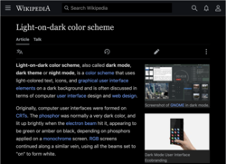

 Comment: I see the gadget was mentioned above (and the extension uses the same styles), so what do people think of it?
  A patchdemo exists to demo the extension, but I'd recommend trying out the gadget for a bit to get a real feel for it. ~TheresNoTime-WMF (talk) 19:45, 30 January 2023 (UTC)
 Strong oppose EpicPupper (talk) 07:29, 19 February 2023 (UTC)

