This page was for nominations in the new Wiktionary logo vote, which lasted from 2009-05-19 00:01 to 2009-07-31 23:59. Each proposal was added under a new section title with a short descriptive name. Logos from the previous vote were able to be included, and users were encouraged to design new ones. It did not have to be the author of the logo that proposed it, but this was likely to be more common for the newly created ones. The proposal should have consisted of:
an image that is 135x135 px to be used as the logo
either an image that is 16x16 px to be used as the favicon, or a short description of how such an image could be created.
After a proposal was added, the following were to have been abided by:
Anyone may comment on or improve any proposal.
The logo in the proposal may be replaced by an improved version of the same logo.
Only one logo should be present in one section. Multiple similar proposals should have multiple sections.
Do not vote on this page.
The proposals on this page should not be modified since the date of 2009-07-31 23:59 has since passed. Voting (in a manner yet to be determined) is to occur. This has wisely been ignored by many people, since, in an online collaboration system, there is little or no purpose served to closing nominations before a vote is finalised, let alone before a voting process or time has been determined. See [[Wiktionary/logo/refresh#Voting.— The preceding unsigned comment was added by Richardb (talk)
I prefer what is here referred to as classic logo. It looks clean, less colorful, and its visual design immitates a dictionary entry rather than the game of scrabble. Unlike the "tile" logo, it does not indicate multilinguality, but that seems to do no harm. What possibly disturbs me is that the tiles are 3D and not aligned in a grid, randomly rotated instead, signaling the lack of order that contrasts to the organized way of our building of the dictionary.
To get an idea how other languages stand with their choice of Wiktionary logo, see also:
Ah, I didn't realize that this is rendered into each Wiktionary's language. The result is a different logo for each Wiktionary. Even the logos in languages using the same Roman alphabet use a half-dozen or more font faces and styles.
The result isn't symbolic, and doesn't provide any visual unity at all. This doesn't adequately fulfil the role, or even meet the dictionary definition, of a logo. —MichaelZ. 2009-03-25 18:06 z
While this logo is not fantastic, I've always found it at least a little pithy and vaguely appropriate for our project. I would not be against considering something new. Atelaes18:14, 25 March 2009 (UTC)Reply
More or less Against. While I certainly prefer this logo to the "tile" logo, I have always been bothered by the word "encyclopedia". A change would be good. -- Algrif15:22, 28 March 2009 (UTC)Reply
With respect to the encyclopedia comment, couldn't it just be cropped differently so it starts with "Wiktionary" and shows more of wilco? 76.117.247.5522:58, 28 March 2009 (UTC)Reply
Really it is not a proper logo, but I would like one who had a certain continuity with the classic one, for example some horizontal lines without text. I believe that it expresses well an entry in a dictionary, better than a book or loose letters. --Vriullop09:11, 4 April 2009 (UTC)Reply
It may not be a "proper logo", but it is the only one I have seen which screams dictionary. If we get more examples which convey the idea of a dictionary and not merely a book I would be a lot happier. The scrabble tiles logo has very little to suggest what it might be a logo for, basically it is just an aesthetic change for the sake of an aesthetic change which is a waste of time. - TheDaveRoss04:20, 5 April 2009 (UTC)Reply
Does anyone else think that the issue of a similar favicon could be solved by replacing the W by a symbol used only in IPA pronounciation, such as a schwa? Ai123815:16, 6 April 2009 (UTC)Reply
I'm sure that approach could solve the problem of the logo looking useless at small sizes, too. The IPA approach is the most inescapably dictionary-ish concept – far more so than a book or spelling-related logos – and it's international by definition. Logos are often revised or have selected parts used when there are size constraints; why not consider a ['wiki] kind of arrangement (excuse my lazy IPA); as it's not actual language you minimalise the multilingualism problem too. It may not be a great logo; but it's currently one of only 3 that don't look like they've come straight from one of those appalling 1990s free clipart CDs. Bob the gorilla01:36, 10 May 2009 (UTC)Reply
Seconded, the other projects' ugly clipart logos are what should change. They all remind me of 16 colour Windows 3.1... not good. Wiktionary's logo is classy. Probably the greyed out bit at the top should say something other than "encyclopedia", but apart from that don't change anything. Just pick a funky IPA character to use as the favicon. But as a non-editor, on an IP, from England... do I even get a say? :o) 86.130.139.23616:01, 3 August 2009 (UTC)Reply
Keep, but only until a better logo is found. This logo does need to be changed, but not for the tiles logo - neither fit with the other logos in the family of Wikimedia projects, but at least this represents a dictionary. I propose starting the process again so we get a design that works. Thryduulf (en.wikt,en.wp,commons) 22:56, 21 April 2009 (UTC)Reply
Lose it! I've never liked this messy, amateurish and ill-focused logo. Seven lines of poorly formatted text is anything but simple! It's also a pain to localize. I'd like something much cleaner and easily recognizable with a favicon that actually looks different to Wikipedia. The tile logo certainly has its problems, but at least it looks like a design rather than just some ugly lines of text. ☸ Moilleadóir☎15:24, 10 May 2009 (UTC)Reply
Change it. Immediately. I'll even take the tiles over this, at least that one's got colour. - Anonymous outsider
Change it. The favicon being the same as Wikipedia is a serious usability problem, as it means I can't tell apart my wikipedia search and my wiktionary search in Firefox. Scott Ritchie00:13, 10 July 2009 (UTC)Reply
Get rid of it. Take a look at the Commons:Wiktionary_logos page. The languages that choose to use the classic logo, and adapt it to their own language, alter the font, font size, alignment of the text making the logos look flawed and unprofessional.
Example:
These three site logos do not look uniform and professional.
Keep the site logo, change the favicon. I've always been an old-timey kind of person, and I like the current logo a lot. It looks like a dictionary entry, at least like one written here in the USA, and is very fitting to the site's theme and purpose. It looks like a dictionary and is for a dictionary site, which is perectly suitable. Sometimes, things do not have to be professional to be good. The current one is dignified, simple, and quite stylish, at least in my view, and would fit properly in a dictionary if it were to be added. However, I agree that the favicon matching Wikipedia's is confusing, so how about changing it to one of those nifty little dictionary symbols, preferably one that pronounces the first syllable of "Wiki"? --99.157.108.24823:13, 13 October 2009 (UTC)Reply
Discard it. I've always thought it looked ugly, it's not really a logo as much as a jumble of text, and it doesn't translate well across languages. -kslays (talk • contribs) 20:39, 26 October 2009 (UTC)Reply
Much like scrabble which is a great logo because of all that scrabble teaches
unique
elegant (just enough)
modern yet classy
Tasteful
there is a W sound in everynine two of the nine languages (?Are there not more than nine languages in the world?)
artistic language characters; very beautiful
the W is emphasised with different coloring
neat and simple
The original colored tiles, #1 should not be changed, it's classy. It is the only one that is clean, sharp & doesn't look like cheap clipart in a monotone, like the others. It is easily recognizable by all ages as representing all types of words (even the attempts at fabricated ones). I love the unusual innovation of the center being personalized for each language. What's not to like unless you have another agenda. I would have thought you would have hired this artist to redo all the other logos into something equally sharp & classy, raising the perceived perspective of all the sites, instead of lowering the standards of this one back into simple clipart.
This is a good place to discuss the above arguments.
Has anybody noticed that the French wiktionary had already switched and it is the wiktionray with the most entries????????
Who designed this? Where can we read their rationale? What do these tiles have to do with a dictionary?
The way I see it, it represents the building blocks of language, and therefore also of the dictionary. The Wikipedia logo is more questionable in terms of rationale, if you ask me. And most of the other logo proposals on this page too.
Can we see what favicon would accompany this, at actual size? —MichaelZ. 2009-03-25 17:41 z
Here's the favicon. The image is 110×120px, but it should be re-rendered at 16×16px for sharper results.
But none of my questions are answered there. —MichaelZ. 2009-03-25 18:14 z
The supporting arguments include: "Friendly, Classy, unique, elegant, modern yet classy, TASTEFUL, awesome". These are just somebody's opinions! Should I add my own opinions to the arguments against the logo? For example: "Unfriendly, copied from Scrabble, advertising Scrabble not elegant, ugly, bad, shit, 'artist' should be shot"? All polemic and controversial arguments should be removed. --88.114.60.15213:45, 11 April 2009 (UTC)Reply
This logo has always seemed really silly and devoid of artistic merit to me (I do apologize if the creator is reading this discussion). As Dan reasonably notes before, it is kind of a jumble, whereas en wikt admins (including myself) walk around and hit newbies in the face with a bat for entering the wrong header level. I can, of course, only speak for en, having little to no experience on any other language. In short, I feel this is wrong. Atelaes18:18, 25 March 2009 (UTC)Reply
Of course, there is no copyright problem! Many games have such tiles, and Scrabble was not the first one (an example of an older game with such tiles is Diamino). And they don't look like Scrabble tiles, anyway: Scrabble tiles have a little number in addition to the letter. Lmaltier19:26, 25 March 2009 (UTC)Reply
"What do these tiles have to do with a dictionary?": at least, they express that it gathers all characters and all words, from all writing systems. Lmaltier20:58, 25 March 2009 (UTC)Reply
Well, I guess I appreciate that already, but I was hoping to learn the details of the author's intent, rather than just what we can guess at. If one is familiar with Scrabble, then perhaps it also evokes searching for words, too. —MichaelZ. 2009-03-25 21:49 z
I proposed this variant of logo for uk.wiktionary because it is easier for translation. I took French logo and translate text into Ukrainian.--Ahonc21:39, 25 March 2009 (UTC)Reply
This logo isn't iconic. It would look a lot better if we actually carved the tiles out of wood and then photographed them on a green screen. 72.177.113.9108:13, 26 March 2009 (UTC)Reply
Honestly, the tile logo looks like someone ate a Scrabble set and barfed in the corner of my screen. I can see why projects aren't adopting it. --Carnildo00:54, 27 March 2009 (UTC)Reply
Against. Never liked the tiles. They are a mess, and the "Scrabble" association is too strong for this logo to be considered an identity, which, after all, is one of the principle functions of a good logo.-- Algrif15:24, 28 March 2009 (UTC)Reply
Against It doesn't look very clean and professional-oriented overall. It looks too much like Scrabble tiles. This is Wiktionary, not a game. --Neskaya04:00, 29 March 2009 (UTC)Reply
Against The different languages in the logo remind me too much of Wikimedia Incubator. How are tiles relevant to dictionaries? And there are a lot more people in the world who do not speak French than those who do. There needs to be an icon like the corner of a page from an actual dictionary, but having the definition of Wiktionary as the very first definition. -BlueCaper (talk) 15:04, 31 March 2009 (UTC)Reply
Against, I agree with Algrif above. I've never liked this logo and I don't agree that it's tasteful(?), it's extremely ugly... The current might not be the best solution, but this is worse. I think that Michael Z. is more correct in his proposal to let the Wikimedia Foundation create a whole new set of logos, especially one for Wiktionary. /Natox10:11, 1 April 2009 (UTC)Reply
Against, I agree with Natox. I never really liked this logo and find it distasteful, language isn't a random jumble of letters. The present logo is not a good solution, but this is worse. Also, whatever happpened to replacing the Japanese character SHI with UI/WI, I find the use of SHI makes it even more distasteful.160.253.128.713:42, 6 April 2009 (UTC)Reply
Possible Support, I would definitley prefer this logo to the current one (if the writing was in a different language, possibly a dead, more neutral language, such as Ancient Greek or Latin, and not French), but I think that a wider variety of choices need to be created - there is room for improvement in this logo (why the hell is it in French?). Other than that, I like the logo (until a better one comes). Spacevezon21:47, 8 April 2009 (UTC)Reply
Against; like other users, am unconvinced of the Scrabble->dictionaries link. I also don't find it very attractive. Would prefer continuing with the current logo, until a better one can is produced. – Spudtater15:46, 18 April 2009 (UTC)Reply
One point I would like to raise has to do with the bottom centre tile: using the simplified PRC-form like 维 for a Han character has political implications. There will be people who will jump to the conclusion that Wiktionary is stating that it is pro-PRC in some way, or somehow prefers the simplified forms of the characters. Far better in my view to avoid this and maintain neutrality by choosing a character which has the same form as a traditional, simplified and Japanese character. Sandalphon22:43, 21 April 2009 (UTC)Reply
Against, while I do think the current logo needs replacing, this is not a suitable alternative. It does not fit in with the rest of the Wikimedia project logos and looks like a combination of Scrabble and Mahjong rather than representative of a dictionary. Thryduulf (en.wikt,en.wp,commons) 22:49, 21 April 2009 (UTC)Reply
"there is a W in nine languages" No, no there is not.
There's a W, and, yes, 維 as a Mandarin character is pronounced "wei" and used to transliterate the sound "wi", so that counts (it's also an abbreviation for the Uighur nationality, besides its basic meaning of "protect"). But the others? I see Greek "L", Russian "Zh", Japanese "Shi", Korean "mal", Arabic "sh", Devanagari "sha" and Hebrew "S"/"Sh". Sandalphon11:06, 22 April 2009 (UTC)Reply
Against Don't like the name wiktionnaire, the logo could work with wiktionairy.
The Wiktionnaire etc. is not part of the logo itself. This is only the name of the project + slogan that will be adapted to each language. Darkdadaah11:35, 29 April 2009 (UTC)Reply
contra this non-logo, this is not the first time an efford is made to force this to Wiktionaries after the voting, many attempts had been made via the mailinglist or mainpage-talkpages and while the communities seem reluctant to implement it, the efford to change it mostly seem to come from the outside, also the voting, this and and a low participation of Wiktionaryans in the voting process itself might explain why the new "logo" is still not implemented everywhere. Most people just want to write entries and not waste their time with discussions about some unprofessional logo attempts, that even have some unanswered copyright issues, please stop wasting our time and let us just work normally without trying to force something on communities that obviously is not widely accepted. I don't see a problem with the current logo, it does not knock out ones eye and thus disturb reading entries and since Wiktionary is not about inventing new words or a game where some people are trying to build words with some letters but a dictionary where we try to present the vocabulary of a given language and some Wiktionaries (at least where I work) even source the existence of the word and give usage examples, definitions, IPA, antonyms, synonyms, hyperonyms, flexion tables, translations, I don't see what that has to do with the scrabble game. Also I agree completely to what this IP said about the <irony>objective</irony> "arguments" in favour.... If a professional or professional looking attempt would be made, maybe You would get my interest, but please don't make Wiktionary look like a children game, thanks.
Furthermore I am quite disturbed by this process as a whole, because most communities have not been informed about this at all and many people will have problems to follow this discussion in English, best regards, --birdy geimfyglið(:> )=|12:18, 29 April 2009 (UTC)Reply
Kontra. The arguments in favor listed above are a joke, aren't they? It can't be meant serious. I completely agree to what 88.114.60.152 wrote above. "unique"? What the hell is unique on a near copy of the scrabble logo? Nothing. And what does this logo have to do with dictionaries? Again nothing. It's the worst choice one could make for Wiktionary. This ugly thing will never be accepted. Btw., not nice that nobody informed any community about this ongoing discussion. Therefore, don't expect that any community will accept whatever is decided here over their heads. Just let each local community decide locally in their language and take these results as one-vote-per-project to get a total result. --Thogo (talk) 12:47, 29 April 2009 (UTC)Reply
I support the logo, and therefore disagree with this opinion, but I agree with the proposal: people not understanding English should not be excluded from the discussion and from the vote. Lmaltier20:20, 5 May 2009 (UTC)Reply
Flawed but better than the 'Classic' one. The big points in this logo's favour are that it is individual and easily recongizable...i.e. it's actually a logo unlike the classic one. The arguments about the game-ish tiles affecting our credibility don't seem very strong to me. After all, Wikipedia's logo contains jigsaw pieces but are they widely ridiculed for it? Not that I've noticed. Of course, I've never really understood how the included scripts/languages were decided on and it can only continue to be a problem. Ideally I'd like a new logo though, something simpler and punchier that maybe the people who hate both logos could agree on. ☸ Moilleadóir☎15:35, 10 May 2009 (UTC)Reply
Support The arguments that is being made about how this logo is too similar to scrabble is, in my opinion, bullshit.
Support More color than the classic logo. It looks like Scrabble, a classic word game. It's playful as oppose to the classic logo, which I always thought was kind of boring. It's already in use at the Swedish Wiktionary [3]. 83.254.128.20 (Jiiimbooh on the English and Swedish Wiktionaries) 00:37, 21 August 2009 (UTC)Reply
Support Better than other logo and it gives the feeling of a "dictionary". Some rare languages like Korean; Korean readers are gonna stop complaining about racism if this logo is on. Very creative, 3-dimensional, colourful.
Oppose. Good idea, but way too messy. It's like the puzzle pieces on Wikipedia's globe chopped and diced and spilled all over the floor. In fact, it's WORSE than the current logo (the dictionary def.) and I don't see how it reflects on "wiktinoary". Deathgleaner20:12, 28 August 2009 (UTC)Reply
Against: Biased much? The arguments listed for the new logo are 3/4 for, 1/4 against; and the arguments for the old are 3/4 against, 1/4 for. Whoever wrote that is a lunatic. I just think this whole poll thing is completely biased. I won't iterate the numerous comments that have come through giving evidence, but if Wiktionary are going to be such jerks about their logo design, I'm not going to support it. Besides, what does Wiktionary have to do with Scrabble? It's a DICTIONARY not a GAME. 203.206.253.21601:45, 12 September 2009 (UTC)Reply
Support. It's fairly simple, could be adapted to Asian languages if desired, and is much more like the other logos - certainly, it's better than the old logo. However, could a circle-based logo, much like many of the others, be used, so as to maintain a trend? Ninington23:20, 28 September 2009 (UTC)Reply
Meh I like it, it's pretty classy, and fits in with the other logos. If lots of people like the current logo though, we should keep that. There should definitely be a formal poll among autoconfirmed users. Thesavagenorwegian00:00, 15 October 2009 (UTC)Reply
I really like this, but I think it doesn't really relate to the other logos at all. 116.22.45.170 11:34, 7 July 2009 (UTC)
That's a misstatement. The Greek, Korean, Persian, and others use variations that replace the W in the middle with a character in their own script. 70.112.20.2308:30, 20 May 2009 (UTC)Reply
Also, this logo DID NOT win the 2006 vote. There were 108 votes in favor of this logo and 135 votes that were not in favor of this logo. That's by no means a consensus. It isn't even a majority. Once we figure out which logo has the most support, we should have a simple vote that says, this logo is to be adopted yes or no? I can't see reaching a definitive conclusion any other way. If that had been the case last time, it wouldn't have reached any sort of supermajority, and could have very well lost outright, meaning less than half. That's not surprising given how haphazardly the entire process was handled. 70.112.199.13303:03, 31 May 2009 (UTC)Reply
Mind you, neither the Wikisource or even, when you really consider it objectively, Wikipedia logos immediately bring to mind the idea of "out of copyright texts" or "an encyclopedia". Yes, they have symbolism, but unless you already know what they are symbolic of, they're just pretty icons (mind you, that's valid for a GREAT many brands. Just try thumbing through a compendium of commercial logos in use and figuring what types of companies use them!). Circeus14:53, 20 May 2009 (UTC)Reply
I don't think resembling a dictionary is necessarily necessary. This logo does in fact relate to a dictionary though (i.e., Wiktionary), because all words all made up of letters, the basic building block if you will of language. Overall, this is by far my favourite design. - Epson29108:57, 21 May 2009 (UTC)Reply
Respectfully, I disagree. You are right that many languages are commonly written using letter-based writing systems, but whatever the building blocks of language might be, surely they must be in language itself, rather than in writing systems? —RuakhTALK13:47, 21 May 2009 (UTC)Reply
But the lack of resemblance must be compensatede by an aesthetically pleasant design, and the design of this logo isn't good. It doesn't solve the cultural centrism problem (why only 9 scripts? why not other ones?), and the logo and its favicon must be changed for languages with different scripts. -Diego UFCG11:12, 21 May 2009 (UTC)Reply
It won the 2006 vote. And has any of the wiktionaries voted against it? Is somebody aware of a language wiktionary clearly against this logo, after an internal vote? Lmaltier15:26, 21 May 2009 (UTC)Reply
This is my favorite. I do like the IPA image below, but I think it would be nice if all the various languages used a similar theme. Certainly better than what is currently used. -Kslays21:07, 22 May 2009 (UTC)Reply
I don’t like this. It’s ugly, IMHO (sorry, author). Certainly worse than what is currently used. I don’t like other logos here either and cannot propose my own. This is very sad. --Vahagn Petrosyan01:09, 23 May 2009 (UTC)Reply
Darkdadaah made an interesting point regarding this logo on the mailing list: [...] the logo should identify the project ("hey, it's Wiktionary!") without reference to something else ("hey, it's that dictionary that uses scrabble tiles!"). Notwithstanding the copyright issues some have cried wolf (of which I firmly believe there are not), the logo is a clear reference to scrabble tiles, and that is a problem. Not to mention that involving the letter W makes localisation too complex by itself: the only thing that should ever change is the text below the logo. Circeus04:49, 23 May 2009 (UTC)Reply
No, it's not a clear reference to Scrabble tiles. It's not because somebody has mentioned Scrabble that this logo should be disqualified. These tiles cannot be confused with Scrabble tiles (though they can be confused with tiles from various other games...) Lmaltier21:02, 23 May 2009 (UTC)Reply
Who said they could be confused? The point is that they are an obvious reference to them. Anybody who's ever seen a scrabble game in their life would immediately make the association, regardless whether it was intended. Circeus00:12, 24 May 2009 (UTC)Reply
I was browsing the French wiktionary and I thought this logo was much better than the English version, in fact I think that this should be the standard for all languages as the Wikipedia logo is for all languages. I think the tiles are neutral and in fact I at first did not think of scrabble (as some suggested one would) but of mah-jongg, and I am not even a player of that game. All this to say that the issue of resemblance to some copyrighted work is not an issue, as many games and products make use of tiles with writing/symbology. In fact, I believe one of the earliest languages, cuneiform, utilized letter-tiles as its basis for writing.
Yeah, but, is that the point? What is it that makes it not just a rehash of the same idea Wikipedia's logo has going on? I mean, if you're going to say that, you may as well consider the two interchangeable, which is not what you want in a logo for an entirely different project. this raven is icy22:17, 24 May 2009 (UTC)Reply
i have to agree with other people it doesn't resemble a dictionary at all It should be a dictionary with wiki in lots of languages on the front but i like it all the same. If it was a translation unit it might just work for me. — The preceding unsigned comment was added by 86.132.216.167 (talk) 13:39, 28 May 2009 (UTC)Reply
I like how this logo was designed so that each language edition would customize the center tile to represent their own language (their script, actually). This way, every language can claim representation on the logo – unlike the Wikipedia logo with its limited space, or any of the "symbolic" logos that have been proposed. At the same time, the logo remains clearly unified – unlike the original Wiktionary logo, which had different typefaces and layouts for most of its variants.
So the existence of variations is controversial, but it doesn't really pose a logistical problem: virtually all Wikipedia editions have their own variations of the Wikipedia logo, since the wordmark and slogan beneath have to be localized anyways. The logo is available as an SVG file, so it can be customized fairly easily (GIMP). I'm not so much wedded to this particular logo; rather, I like the way this logo strikes a balance between localization and unity, and another logo that does it effectively may well have my vote.
I'm glad that the majority of proposals here, including this one, are not literal depictions of a dictionary. Google chose not to use binoculars or a magnifying glass in their logo (as did WebCrawler), BBC News's logo doesn't depict a newspaper, and AT&T's iconic logo doesn't depict any kind of communications device. None of these brands resorted to identifying with a physical device, because that's the quickest way to look outdated. Using a dictionary as our logo would be tantamount to describing ourselves as "a generic word lookup tool", which might be appropriate for many reference websites. But I'm sure Wiktionary's goals are a bit broader than that.
Just make sure no one makes a variant with little numbers in the bottom-right corner of each tile, okay? :^)
I don't like this logo, because a logo displaying only a handful of languages cannot represent all the world's languages. We need something which is impartial to all the world's languages. It's not correct to choose languages based on real or assumed usage statistics. I'd give my vote to a logo which depicts - pictorially - something like a mouth and a callout...--ಕಿರಣ11:32, 8 June 2009 (UTC)Reply
both refer to games (jigsaw puzzle games, and letter tile games)
both include letters in various scripts, in order to insist on the multi-language nature of the project (which is still more important in Wiktionary)
The Wikipedia logo has been very successful, and this is probably the strongest argument for confirming the decision about this logo. Are there arguments against this logo not applying to the Wikipedia logo? Lmaltier13:48, 12 June 2009 (UTC)Reply
I like this one most. It's a simple idea, not cluttered with symbols. The tiles reference games based on words, as Wiktionary is. I don't agree that it is bad, since not representing all the world's languages. If you wan't such a logo you need either to list them all or use a symbol like a globe or a map of the world, which is abused when it comes to representing internationalism. There are maybe more creative ways to picture the humanity as an unity, like the Olympic or Ubuntu logo, but the characters are clear (also aesthetically) and, as I said, keep the climate of dealing with languages. Moreover, I suppose that most of the users don't know what is every single character for the IPA "w". 89.77.178.15417:53, 13 June 2009 (UTC)Reply
It is not possible to represent everything everywhere, so let's stop trying to do that, first of all. This has a good sized smattering of different characters, but at the same time, it seems simple, so, unless we could put some text on the next one down (IPA would be better than alphabets, as it is supposed to be universal), this would be my vote. Rychach00:24, 16 June 2009 (UTC)Reply
I strongly oppose this logo on the basis that having the Latin script tile centered and bolded in red is too Western-centric. I understand that it is the favicon, but it is nonetheless Latin script representing a project involving many different scripts from around the world. Why not put the Wikipedia or Wikimedia logo there instead? Britney-Boy09:48, 16 June 2009 (UTC)Reply
Actually, this is one of the reasons this logo is not a good logo : it should be universal, not customizable. One of the reasons to find a new logo was because every project had its own version. Darkdadaah15:16, 4 July 2009 (UTC)Reply
I think the problem was more that the local versions often looked nothing like each other. The local versions of this logo are substantially similar. – Minh Nguyễn (talk, contribs) 21:35, 9 July 2009 (UTC)Reply
I wonder how this logo would look like if the tiles are stripped from it, while the letters and their spatial arrangement are kept. It could actually look good, to me anyway. Also, after stripping the tiles, the letters in the present arrangement could be combined with a speech bubble shown in some of the logos proposed lower in this page, yet I would prefer a simple speech bubble without double strips. --Dan Polansky08:32, 8 July 2009 (UTC)Reply
Acceptable but mediocre. Sorry, it's not very attractive, dynamic, appealing. No real links to other projects. Rather not bother with change if this is the option, --Richardb03:09, 14 November 2009 (UTC)Reply
Exact same problem as the first replacement: many languages don't have the sound /w/, and the IPA is heavily skewed toward the Latin alphabet (which is, when you think about it, worse than the writing systems choice issues with the first replacement). Circeus04:52, 23 May 2009 (UTC)Reply
Very true, but at least we can blame that on the IPA. Alternatively it would be cool to use symbols from phonetic alphabets in various languages, like Chinese bopomofo or the AHD's oo with a line on top. As it is, I don't think it matters if many languages have the sound or not, the symbols are just pretty. DAVilla05:33, 23 May 2009 (UTC)Reply
I quite like this as a design, but I can't help feeling it's a little too strong to use as a logo. It doesn't blend in very well when put beside the other project logos and I think it would really stand out on the page. Maybe that's a good thing for some people, but it doesn't work for me. ☸ Moilleadóir☎12:11, 25 May 2009 (UTC)Reply
Are you saying the quality must be low on account of poor logos already included, that ours should look as dull as ? Sorry for being negative. In my opinion the best logos are the ones that stand out. Wikipedia. Wikinews. Wikisource even started as . I'd be happy with something a little more symbolic than photographic as long as I could believe the characters to be etched into wood, having if not the texture then the right tone, at least, rather than the color of puke. DAVilla05:33, 26 May 2009 (UTC)Reply
Just saying that I think part of our brief is to find something that harmonises with the other project logos to some extent. Where we draw the line between too similar and too different is open for discussion, but if we can't even agree on a general principle like that then this whole exercise is doomed. Perhaps we've moved too quickly onto proposals and should've worked out the general principles of what we want from a logo first.
I don't agree that the other project logos are of low quality. In the case of Wikibooks I think you're confusing dull with simple. For an image that will be shown at different resolutions simple is a huge advantage.
I also don't think that any of the current logos have such radically different designs. The only one that is particularly different (apart from Wiktionary of course) is Wikipedia and even that is still circular. ☸ Moilleadóir☎06:08, 26 May 2009 (UTC)Reply
I know the difference. Wikiversity is detailed and Wikiquote is simple, though neither are very colorful. Wikibooks is both simple and dull, and not circular wherever that came from. Anyways we have two full months to not only discuss the principles but also to illustrate them with proposals and variations thereof. Speaking of principles, it appears some higher-ups don't want logos that are too close to the Wikimedia logo. I imagine Wikispecies is the primary impetus for that decision. The last time we voted on a Wiktionary logo, 3 of the 4 finalists said in the titles that the colors would have to be changed. And (possibly because of that) they all lost, by the way. DAVilla17:36, 26 May 2009 (UTC)Reply
Even Wikiversity's logo isn't this detailed. These should be simplified to two tones- one shadow tone for the side, like a leathery grey-brown type, and for the normal top tone, a woody [not pukey] brown. This one has potential, but es gibt too much detail and the brown is kinda pukey like the person above said. Contributions/24.167.214.5321:27, 15 June 2009 (UTC)Reply
The person above (i.e. me) said that the adopted Wiktionary logo up top, not this one, is pukey. If the person who designed this logo (i.e. me) didn't like the color, another tone would have been used. But if it would win your support, I'm all for cutting these out of real wood and just photographing them.
And for the record, Wikiversity's logo is good, but it would be better if it were more detailed, if the columns looked more like book spines. DAVilla20:03, 17 June 2009 (UTC)Reply
I really like the look of this one, but I would like it to say "Wiktionary: the Free Dictionary" somewhere. If that were added, in a proper font and design, this would be my favorite. Rychach00:21, 16 June 2009 (UTC)Reply
We should really have some regularity in that regard. Either all of the logos should say that, or none of them should, for the purpose of comparison. The tile logo above has a version without text, and why someone decided to use the version with text is beyond me. Maybe they thought it would get an advantage that way. Of course once the logo is selected, the text will be added in each language, so it is really not all too relevant. Of course it could play a deciding factor if the text were stylized a certain way though. Consider the logo for Wikiquote, which adds pizazz to the simplistic logo, yet is not rendered so imaginatively in all languages. DAVilla05:05, 16 June 2009 (UTC)Reply
I'm sorry, but I really don't like the idea of a photorealistic logo. I'd like a vector graphic, please. You may say that the other logos are 'boring', but I say that a photorealistic logo would be overemphasised, possibly distracting from the content on the page. I much prefer the current logo of Wikisource to a photo of an actual iceberg. Similarly it wouldn't be a good idea to replace the stylised globe in the Meta logo with an actual photo of the Earth. Keep it simple, stupid. Ephemeron17:40, 20 June 2009 (UTC)Reply
I feel very strongly that a vector graphic should at least include enough detail to make it look realistic. The adopted logo above doesn't even have beveling for the characters, so it appears they are printed flat rather than etched. There must be a happy medium, and personally I'd be much more comfortable having a vector graphic created from this, than voting in the one above, which will never be altered. DAVilla23:04, 21 June 2009 (UTC)Reply
I've wound up switching computers a few times this month, and I just realized it looks better on some computers than on others. Thanks for voicing your opinion twice. DAVilla16:30, 15 July 2009 (UTC)Reply
Latest comment: 15 years ago8 comments7 people in discussion
This logo is for everyone. It's for those who think wood doesn't make a permanent enough logo, or those who are still haunted by childhood memories of Scrabble. It's for those who are so good at word games that they could play a hand stacked with obsolete symbols, or those who don't like a logo concept to be trumped by flashy colors. The favicon would be a single tile etched with W () or whatever other character from the localized Wikipedia favicon.
I think this would work better with the oh-so-grey Monobook background than the wooden tiles, but after looking at them both for a while the warmth of the wooden ones is more appealing somehow. The Wiki gods won't let us do backgrounds, will they? Would be good to see how all these designs look in context. ☸ Moilleadóir☎14:58, 28 May 2009 (UTC)Reply
This looks great and at least ties-in with the grey and the characters of the Wikipedia logo. The "Wiki..." projects should all relate to one another. In fact, a professional update to all logos should be considered: not to change the logos per se, but to apply a consistent style and quality.
From what languages are the letters? I could only recognise Kāp from Estrangelo (the above right corner)... Bogorm15:06, 5 June 2009 (UTC)Reply
If you can recognize any of the letters then I've made a mistake. I was trying to use only letters that are archaic or obsolete, either because the language is dead or because the characters are no longer used in that script. I started by looking at Old English texts but you would be surprised how many Latin variants continue to be used in various languages. Tracking down a good mix wasn't an elementary exercise. I believe this restriction eliminates a lot of choice in the matter, making the selection not quite as arbitrary.
The bottom row is Chinese, Greek, and some type of cuniform. The Thai and Korean aren't hard to spot either. There's also an unused IPA symbol, and I don't remember what all the others are. Wait until I can get my computer running again. DAVilla20:33, 7 June 2009 (UTC)Reply
Just passing by. I've looked these all over and this one seems the most appropriate. It has an element of Scrabble to it, but also Mahjong. I think this image is a tad too black; more gray would be a good nudge. Mebbe an ivory look with some of the usual colors on the letters. Please avoid silliness like Klingon. Cheers, Jack Merridew07:33, 21 June 2009 (UTC)Reply
To much details, and we are out of the dark ages, blue would better, but even then I wouldn't get any enthousiasm for this one. Romaine18:53, 6 July 2009 (UTC)Reply
I think this one looks brilliant - No copyright infringement of Scrabble, and I love the favicon idea -> but shame there is no W on the full logo 78.86.128.3715:53, 20 September 2009 (UTC)Reply
One of the better variations proposed in the first round, though mildly language-centric. I think the idea of playing with the W is good. Circeus14:40, 20 May 2009 (UTC)Reply
The biggest thing I don't like about this logo is it doesn't lend it self well to non Latin languages (ex. Greek, Cyliric (Russian), Arabic, Hebrew, and South/East Asian languages), where the stylized "W" means nothing. Plus every wiki project starts with a "W", why should this logo be used for this one, and how does it connect to its purpose of representing a wiki dictionary? - Epson29108:34, 21 May 2009 (UTC)Reply
Looks more like Greek omega than double-yew, and I don't mind that.24.79.79.87
Latest comment: 15 years ago4 comments4 people in discussion
Combination of a design by Yorktown1776 and one by User:Rei-artur made by User:Sannab on a proposal by User:Vildricianus. The favicon would consist of just resizing the logo to 16px, or using only the w-part. /
Yeah, I have that problem with Wikiquote too. The speech bubble is fairly universal, so I'm not sure why they didn't adopt it. DAVilla08:03, 27 May 2009 (UTC)Reply
Another from the previous proposal process. Puts the accent on the "speech/language" aspect of Wiktionary. Possibly a good avenue if we toy with the speech bubble part. Circeus14:40, 20 May 2009 (UTC)Reply
I like this one much better than Calligraphy, I didn't realize before but yeah, the speech bubble is kinda weird, it may be worthwhile to toy with it, but overall it is a nice logo. And, it has something to do with a dictionary, even if it focuses on the language part of it. - Epson29109:01, 21 May 2009 (UTC)Reply
I don't think this fits a dictionary. This would be a perfect logo if the project had more audio or spoken parts to it. It just doesn't make me think of a dictionary. --penubag03:48, 22 May 2009 (UTC)Reply
If we start from the (fairly legit IMHO) assumption that the logo should eschew the used of written characters of any sort, how are we to represent the idea of "language" or "words" that is central to this project? 04:53, 23 May 2009 (UTC)
Didn't you just prove the point of why the idea to eschew the use of written characters of any sort is not a legit assumption? I mean, seriously - Wikiversity gets away with the not-language thing because it's not a language-centred project. Similarly, Wikisource has a clever little pun going on, etc. - but this is the one most languagey project. We'd be idiots not to use some sort of writing to represent it. this raven is icy22:13, 24 May 2009 (UTC)Reply
But the problem is with "some sort of writing", whichever characters are used there will be some who are aggrieved that their language is omitted/overlooked/snubbed making consensus difficult. This proposal overcomes this and, in addition, reflects the fact that more words are spoken than written. Saga City16:46, 20 June 2009 (UTC)Reply
I think that maybe if you add some characters to the speech bubble, it might relate more to wiktionary.
I see a candlestick, but where are the faces? Joking. But I'll ditto whoever said above that it does not represent a dictionary. Ephemeron18:19, 20 June 2009 (UTC)Reply
The logo doesn't describe in a picture the different words and alfabets that the different project contain, so the logo fails in showing what Wiktionary is. Romaine18:30, 6 July 2009 (UTC)Reply
Why talking? Wiktionary is wrote, not talked, so I think this logo is inappropriate (and ugly, too). Sorry... --Aushulz23:32, 8 July 2009 (UTC)Reply
I humbly disagree: Wiktionary is all about communicating, talking and expressing oneself. One doesn't use a dictionary just to write words, especially Wiktionary which gives a lot of informations, including pronunciations and translations. And there are some languages that are not even written... Darkdadaah12:16, 9 July 2009 (UTC)Reply
I think this is one of the better suggestions, though it could need some finishing to not look as much as a squid-sucking couple, as Hartopp pointed out, with right. I think it's a great idea with actual talking involved in the logo instead of writing. Wikipedia is also written, even wikispieces is written. My opinion is that the wiktionary logo should point out that which is unique for a wiki for languages: that it's about communication! And communication is a very beautiful thing, you agree? Svenji15:08, 21 August 2009 (UTC)Reply
Latest comment: 15 years ago10 comments9 people in discussion
I haven't decided on what the Favicon would be. Also, note this is an SVG so it will resize to any appropriate size automatically. Note the gold edge and the thumbpoints, similar to a dictionary.
According to Landau, including a thumb index in a dictionary “is strictly a marketing decision,” and they are popular with American buyers, but “to the great relief of British publishers, thumb indexes have never caught on in the UK dictionary market.” (S.I. Landau 2001, Dictionaries: The Art and Craft of Lexicography, 2nd ed.)
So I don't mind the thumb index, but it probably doesn't speak to everyone. To resemble a big dictionary at the micro-scale, the type on the book pages should probably be arranged in two or three columns without line spaces, rather than in evenly-spaced paragraphs. —MichaelZ. 2009-05-22 18:26 z18:26, 22 May 2009 (UTC)Reply
Well, hopefully people more competent will refine the logos at later points in the process. Not even all of them are in .svg to begin with. Circeus04:55, 23 May 2009 (UTC)Reply
How about a big and heavy dictionary that is portrayed as easy to pick or carry or some other ease associated with it to emphasize the fact how easily available and easy to use Wiktionary is. 98.216.7.3607:44, 5 June 2009 (UTC)Reply
Too obvious and unimaginative. And not elegant enough; I mean the other logos have some degree of elegantce without overemphasising themselves. I don't see much in favour of this logo except that it communicates the idea of an online dictionary in the a pretty (duh) simple and obvious way. Ephemeron18:06, 20 June 2009 (UTC)Reply
Also, Favicon is identical to Wikipedia's.24.79.79.87
Indeed. It's a mess to localize, and various little things (i.e. pronunciation in en:) are always causing trouble. Plus the logo itself cannot exist separately from the name/slogan, which removes any usefulness of having a logo in the first place: you cannot use the logo without using a specific language. Circeus21:32, 21 May 2009 (UTC)Reply
Very clever, but I think you just proved the point. Those are all stylized, one is only two letters and two are single words. They are also never localized. How can you possibly compare that to a jumble of 10+ words that will be different in each language anyway? We're looking for a logo, not an essay. If it's too diffuse to use as a favicon then there's a good chance it's not a good logo. ☸ Moilleadóir☎17:40, 23 May 2009 (UTC)Reply
Agreed. And “Wiktionary” is not a great name to use internationally (note that these companies no longer call themselves Daiwa Kogyo, General Motors, or Standard Oil), and unless you think Wikisłownik, Βικιλεξικό, Вікісловник, and a dozen other projects that have already rejected this logo will rename themselves “Wiktionary,” then this logo is hopeless. —MichaelZ. 2009-05-24 19:09 z
Furthermore, the RP-centric nature of even the English version of this logo, while not overtly offensive, is pretty annoying. It's not just that dictionary has four syllables to me, or to my continent. It has four syllables to a lot of people (including, I'm pretty sure, many ESL students). It's just not very diplomatic. I think this logo is basically dead in the water anyway, it doesn't seem like anyone wants it, but I think it's important to realise why specifically we don't want this, even for en.wiktionary. A slight tangent now, forgive me - That reason, however, is not because other projects' names are different. Wikipedia has been quite all right creating new logos (although many of them are poorly rendered) for projects named Uiquipedia and so forth, which is my number one rebuttal for the idea that the W, by itself, is ethnocentric: If anyone else wants to use a different symbol, they will. W is just what is most semantically appropriate for English - and a host of other languages. this raven is icy22:08, 24 May 2009 (UTC)Reply
Question: Where did this one come from? Personally, I wouldn't mind seeing that as the logo, without the stuff in the background or the green pronuncer etc. on the bottom. Gus Polly17:18, 5 June 2009 (UTC)Reply
Wilco is, in fact, the next English word after Wiktionary alphabetically. But it's still weird and distracting. I'm guessing the idea was to establish that it's a dictionary. AAEngelman11:36, 2 July 2009 (UTC)Reply
I see I'm clearly in the minority, but I have always liked this logo (or whatever petty people like to call it). So my vote/!vote/contribution to the discussion is to keep this one. (Although I do agree that the RP is a tad grating). ÷seresin22:52, 10 June 2009 (UTC)Reply
It was never meant to be a logo, just a placeholder. It 'is' broken. It doesn't look at all right in other languages, less so in those that don't use latin characters. A project logo has to be easily adoptable by other languages. --bastiquedemandez!15:09, 2 July 2009 (UTC)Reply
A variant of this logo could be made, without the gray texts above and below, meaning "a multilingual free encyclopedia" and "Wilco". This would simplify the logo, remove the erroneous impression some people get that it refers to an encyclopedia, while keeping the clear signs that the logo is one of a dictionary.
The favicon would be made from the letters ' and w found in the pronounciation guide in the logo. Thus, the letter would be in sans serif, distinguishing the favicon from the one that Wikipedia currently has. --Dan Polansky08:27, 8 July 2009 (UTC)Reply
Cool, but I don't like the two favicons proposed. "W" is too generic, can be related to any wiki-project. --Aushulz23:37, 8 July 2009 (UTC)Reply
This one's an oddball that came to me. It's a very rough representation (I'm no logo designer), but the concept, that of a schematic dictionary entry (as opposed to one with actual text), should be relatively straightforward. Circeus21:20, 21 May 2009 (UTC)Reply
I like the concept of a schematic entry of a dictionary, but not this design in particular. It might have a certain continuity with the "current logo" above, with horizontal lines instead of words, but it should be still more schematic to use it as logo, and better with some colors. --Vriullop09:43, 23 May 2009 (UTC)Reply
I'm not going to pretend the proposal is very good. As I note, I'm no designer. I'm hoping some people will be able to build on it. Circeus00:09, 24 May 2009 (UTC)Reply
But this looks more like an encyclopedia entry. Usually dictionaries don't have images (as I'm assuming that grey square is). Also, I'm not sure how anyone would be able to make this look professional.69.230.79.10201:33, 24 May 2009 (UTC)Reply
Latest comment: 15 years ago27 comments23 people in discussion
The square brackets "[[ ]]" refer to the wiki-syntax link that connects the user to other parts of a wiki-dictionary. When these brackets are connected with dotted lines, it appears to be an open book, or dictionary. They are connected with a dotted line rather than a solid one because the content of Wiktionary is open. The directed arrows coming out of a circle are inspired by the Wikimedia Commons Logo and refer to collaborative and the always expanding nature of wikis.
I'm a bit meh at it. Yes it's a very nice logo, but it just doesn't ring much as a logo specifically for Wiktionary. It could be the logo of just about any of the Wikimedia projects. Circeus04:38, 23 May 2009 (UTC)Reply
And seriously, the tile logos need to go into one of the places where things go to die. Sorry to the projects that use it, but I really don't like it and I will raise holy hell before the ENGLISH Wiktionary adopts anything of the like. --Neskaya17:24, 24 May 2009 (UTC)Reply
I don't know why you said that here - it's not like this logo is any better, other than in how it services your need for a different kind of graphic design. I second Circeus; there's nothing that makes this a Wiktionary logo and not just a Wiki-stuff logo. In fact, this is basically just the same as the Mediawiki logo, without the media part, and I never liked that logo either. I'd support it as a logo for some other general Wiki thing, but not for Wiktionary. this raven is icy21:53, 24 May 2009 (UTC)Reply
I'm not talking about the other logos, I'm talking about this logo, and you're wrong, most of them do have elements that are specifically thought for wiktionary, this one has no association that are unique in referring to a dictionary or even just language. Circeus00:08, 24 May 2009 (UTC)Reply
I think that this looks more like a representation of a monitor or TV screen than anything else. The arrows do work as a representation of growth or expansion, but perhaps more in the “pushing the boundaries” or “innovating” sense, which is probably not meaningful for Wiktionary. Also, I agree with sentiments that it is too similar to the MediaWiki logo or applies to broadly to wikis in general. —195.194.50.312:09, 26 May 2009 (UTC)Reply
God forbid that we'd give people the impression that any innovation was happening on a wiktionary. No, no boundaries being pushed here...oh wait, every word in every language... ☸ Moilleadóir☎14:03, 26 May 2009 (UTC)Reply
The major issue is not that the symbolism is inappropriate, it's that the symbolism could applies to any WikiMedia projects. The new should have some element(s) that applies specifically to Wiktionary, but this one doesn't. Circeus16:13, 26 May 2009 (UTC)Reply
At least this one is as unbiased as it gets. Not eurocentric, US centric, or doesn't contain any overly vague concrete representation of a dictionary. --penubag10:33, 28 May 2009 (UTC)Reply
The text 'Wiktionary, the free dictionary', is currently a part of the logo: None of the other wiki-projects do that: They all have a clean logo, with the text underneath, and this text can then be translated and localised. To fit in with the other logos, it would hav to be made a little longer. (A small detail, but it's the small stuff that most often is annoying...) V8509:15, 30 May 2009 (UTC)Reply
I lovvvve it, but I like the one on the alternate page with the red circle and green arrows better. Also, why is "ionary" in a different colour? Also the "o" is out of line it seems. Contributions/24.167.214.5321:33, 15 June 2009 (UTC)Reply
Thanks for noticing those errors, I have fixed them. If you bypass your cache, you'll see the new version. The reason the red circle/ green arrows wasn't used is because the rules state to not use WMF colors, which those are.--penubag00:08, 16 June 2009 (UTC)Reply
I like this one except for the execution of the circle with the arrows. In the Commons logo, I like how the outer ring and the arrows are the same color, and the arrows are of uniform size. I think that would benefit this logo. I'd probably vote in favor of it then. Opiaterein11:57, 16 June 2009 (UTC)Reply
My favourite that I've looked at so far. It looks like an open book, which is great for a dictionary. However, I don't like the arrows in the middle for two reasons: 1) There is too much contrast so it far outweighs the "book" aspect, perhaps give the arrows a lighter faded-to-grey colour, 2) The arrows are not symetrical, which personally drives me crazy! Raven Morris 96.49.86.5223:58, 4 July 2009 (UTC)Reply
I'm not sure of the benefit of putting Wikilinks around the symbol. All of the projects are Wikis, and none of the others seek to represent this in the logo. I WOULD like to see an example of the concept-connect star above a book, like the ones below. - BalthCat11:31, 5 July 2009 (UTC)Reply
The [[ and ]] have nothing to do with Wiktionary in specific, the logo doesn't make kleur the different alphabets are represented on the projects. Romaine18:28, 6 July 2009 (UTC)Reply
I like the concept. But prefer a red circle at centre, and have the arrows heading into the red circle, not outbound.in common with other projects.--Richardb03:21, 14 November 2009 (UTC)Reply
Latest comment: 15 years ago6 comments6 people in discussion
These logos are just sketches. I would be grateful if someone improve them.
User alone
Favicon
They show a person (any Wiktionary user) inside his/her own speech bubble, meaning the (s)he is talking about his/her own universe. At the same time, the form of the bubble resembles an @, to emphatize that Wiktionary is an electronic dictionary. We can also interpet the circular arrow as that our knowledge always has feedback, due to the collaborative nature of the wikis. I haven't decided the final colors yet. -Diego UFCG12:05, 23 May 2009 (UTC)Reply
I've split this proposal into two seperate ones in accordance with the rules at the top of this page. (Multiple logos in one proposal can lead to skewing the voting; while I much prefer the one without the monitor, if I voted for this proposal I would give equal support to both.) Conrad.Irwin12:37, 23 May 2009 (UTC)Reply
Ooooh ooooh ooooh. In all seriousness though, I like this one even more than the other one that I said I liked. I highly prefer the gray colourscheme to anything with bright colours. This is influenced by the fact that I have a processing disability, and reducing unnecessary use of bright colours helps me to still be able to work on the project that I enjoy. Again, I like the one without the monitor, but either of these are highly preferable to anything else that I have seen so far. --Neskaya17:27, 24 May 2009 (UTC)Reply
This has great possibilities. How about just an at sign with the end of its tail curled down into a pointer. It becomes its own speech bubble. It would be more typographical a literal sketch of a person. It also includes the letter A, from alpha, the original first letter of any alphabet (not all-encompassing, but pretty universally understood as an important first for written language). —MichaelZ. 2009-05-24 19:16 z
The @ symbolism is great, but the only time that symbol is used on the internet is for email suits. Although a great logo for a mailing service, not good for representing a computer system, let alone a dictionary. --penubag08:58, 28 May 2009 (UTC)Reply
Once it has colours, it will fit in well with the other logos, I envision the head to be the same dot as Commons, the line around it blue, and the torso meta-green (but that's just my suggestion). Again: Wiktionary should not be a part of the logo, none of the other logos have the name of the project in the logo, it's just text beneath, which can be localised, the same should apply to Wiktionary. Also, the line around is not even, right after the little curl pointing in as a speech bubble, it should immediately become a circle, and not have a little straight line there... V8509:19, 30 May 2009 (UTC)Reply
Okay, so here's what I want: The monitor is given more prevalence and full of glyphs (stacked on top of each other, Kindle logo style, not given personal real estate like everything else we've seen). The curlicue is given either a smooth style or the rougher thing going on at its starting point (personally I dislike the whole "Everything is smooth!" fad), and its arrow is turned into the lower half of the pointer on a speech bubble so the whole thing more accurately represents the letter a as was mentioned in the previous proposal. I'd show what I'm talking about but the juxtaposition of my geekiness and homosexual tendencies has unfortunately not lent itself to the pursuance of graphic design skills. Anyway, I think this is the best idea so far, either with or without the monitor. I stand by what I said before about using some sort of written language to represent this project, and that's why I'm trying to take advantage of the monitor as a space to contextualise that without being ethnocentric. Honestly, if any one project should use written language, it should be this one, and not Wikipedia. this raven is icy22:30, 24 May 2009 (UTC)Reply
But like you seconded to the comment above, this doesn't relate to Witionary but for any Wikimedia project. --penubag23:41, 24 May 2009 (UTC)Reply
Without considering whether this logo and the one without the monitor are any good in their own right, I think that they are incoherent with the other existing WikiMedia project logos. This is probably because they contain fewer colours and are set at a lower contrast against the background in comparison to the other logos. I do not think that this is necessarily a bad thing, but I think that the other logos would need to be modified to keep in line with it. —195.194.50.312:23, 26 May 2009 (UTC)Reply
This is a speech baloon, because Wiktionary is about languages. It has inward and outward arrows to mean that in Wiktionary anyone can acquire (reading) and provide (editing) knowledge. -Diego UFCG12:05, 23 May 2009 (UTC)Reply
I can't see the colour things on this. However, I'm noting that anything with bright colours is incredibly detrimental to me trying to use the computer, due to some sensory issues that I have. They're pretty and squee in real life, but if there's bright colours where they don't need to be on the web page, it makes it harder for me to use. A lot harder. --Neskaya17:31, 24 May 2009 (UTC)Reply
The speech balloon resembles a hand for me, a C-shape holding one of the arrows between thumb and forefinger. I like your symbolism (acquire and provide knowledge) with your arrows, but sadly I can't understand that's what the arrows are about at first sight. Which direction are they going to? Maybe arrows that loop onto themselves (like the recycle logo) would work better to convey that, as we build from our own edits. --Icqgirl03:10, 27 May 2009 (UTC)Reply
Horrible logo. No mercy. I created an account just to post this. Looks like "Web 0.5" and no where near something like "Web 2.5". Rough edges, contrasting colors. Tekboi06:34, 29 May 2009 (UTC)Reply
I like this precisely because it's abstract. The task of representing everybody's idea of a dictionary (is it a book? no it's a website, etc., etc. ad infinitum) as well as catering for many different languages is probably an impossible one. A logo does not have to directly represent the item that it's branding. How many people's computers look like apples? And yet, Apple has an instantly recognisable and very effective logo.
Simply using a logo as the logo for wiktionaries will make it the symbol for wiktionaries. We just have to choose one we can all accept. ☸ Moilleadóir☎07:26, 25 May 2009 (UTC)Reply
I went through all the images in this page, looking at only one thing, the favicon list. Which allowed me to analyze what place the proposed logos had compared to all the other logos. This is the only logo clean enough to be a part of WIKIMEDIA. One thing must be noted though, the text below the logo must be removed from the favicon. Tekboi06:46, 29 May 2009 (UTC)Reply
I just took this from here, just a variation that never had a version without text. I've made one now.
Did you decide this one fits in based on colour or on shape? There seems to be some confusion about how similar to the others the logo should be. People have pointed to a document about the Foundation logo (which only talks about that logo and its use) as though it said something about how new logos should be different but I can't see it. So, it's possible someone may demand the colours be changed. ☸ Moilleadóir☎01:46, 30 May 2009 (UTC)Reply
I actually like the concept of a magnifying glass the best. But IMHO this one is stylized a little bit too much to the degree that it no longer resembles a magnifying glass, so maybe make it less abstract - and the colors changed as well. Wyvernoid05:24, 31 May 2009 (UTC)Reply
I think it's meant to represent something like this rather than a glass with a handle. I think a magnifying glass with a handle would probably be a huge waste of space and wouldn't be clear at icon resolution at all, but hey why not put a proposal together if you think it's a good idea? ☸ Moilleadóir☎11:45, 31 May 2009 (UTC)Reply
Actually something can be put under the magnifying glass so there is something under the handle too, and in this way no space is wasted (like the two pictures on the right). Also maybe look at this website (it's in Chinese but doesn't matter), there's an icon at the left top corner which pretty much describes my idea, and the favicon is clear enough. Why don't I put up a proposal? Well my image handling skills aren't that good... but maybe I'll try. Wyvernoid05:29, 1 June 2009 (UTC)Reply
I love this logo, mainly because it is so abstract and still suggestive. I don't want a logo that takes focus away from the page, like the wooden tiles do imo. Also, it doesn't have to be a magnifying glass; it bears resemblance to a hard disk as well, and I wouldn't be too surprised if they found one of these inscribed on a cave wall by palaeolithic humans as a depiction of a sun or an eye. I see this ambiguity as an enormous advantage. wikt:User:Hymyly20:50, 15 June 2009 (UTC)Reply
This is one of the only ones even remotely useful as a logo. It has a good, clean, unique look as a logo and favicon. The tiles are obnoxious, and the wikilink one looks nice but has a poor favicon and doesn't have anything to do with a dictionary. This one might not either; I don't think anyone would guess it was supposed to be a stylized magnifying glass, but its clean look and abstract style make it very useful as a logo. It could be improved with a single letter inside instead of a globe, but whatever. --71.90.81.2901:19, 27 June 2009 (UTC)Reply
This is clean (very clean) without looking too "corporate". It is thoroughly in-keeping with the WikiMedia identity without being confused. Also, the concept is perhaps the nearest to a multi-lingual/multi-cultural one that has been submitted. Hartopp21:41, 9 August 2009 (UTC)Reply
Different enough from Meta? Not sure, but a globe is one way of emphasising the international nature of the project. I started out with some more detailed globes, but I'm a bit unsure about their licences and a stylised globe prevents arguments about whose country's on top. ☸ Moilleadóir☎08:19, 25 May 2009 (UTC)Reply
So is Meta is a mapping project? Or is it the magnifying glass that makes you think that? That's our dilemma though isn't it? What does represent a wiktionary? If you say a book, someone else will say "But it's a website". If you suggest text or a character, someone will say "But that doesn't include my language". ☸ Moilleadóir☎02:30, 26 May 2009 (UTC)Reply
I like the magnifying glass. Maybe with a stylized book instead of a globe. Bob Burkhardt 13:01, 29 May 2009 (UTC) It might be worth devoting more room to the handle. Instead of a point a rounded grip of some sort so the whole has the shape of a lop-sided double bubble with a smooth connection in the middle. Bob Burkhardt13:27, 29 May 2009 (UTC)Reply
I'm not sure I can picture what you mean, but it sounds like a different proposal. I like the simplicity of this shape and although it looks like there's lots of room in the large size, you have to consider the icon as well. I also really like that it ends in a point! ☸ Moilleadóir☎02:29, 30 May 2009 (UTC)Reply
Latest comment: 15 years ago11 comments7 people in discussion
A variation of Rei-artur's magnifying glass incorporating cuneiform character U 𒌋 (U+1230B), chosen mainly for its shape. Not a totally neutral choice of symbol, but going for a very early form of writing might bring us closer to something universal.
There are many other interesting shapes to choose from e.g. AN 𒀭 (U+1202D), ERIN2 𒂟 (U+1209F), HAL 𒄬 (U+1212C), IDIM 𒅂 (U+12142), KUR 𒆳 (U+121B3). ☸ Moilleadóir☎05:59, 28 May 2009 (UTC)Reply
I like this proposal a lot, particularly the 𒌋 version (the others are more complicated, this is simple - though I might flip the character so that it points forwards instead of backwards). I've edited this proposal to contain one image, to follow the rules at the top. Conrad.Irwin20:57, 28 May 2009 (UTC)Reply
I think we're still in a kind of brainstorming phase really. Maybe it would've been better to start with a page with themes and variations on the understanding that concrete single proposals would have to be put on a new page for voting. Actually it would've been best to start with a discussion in general terms of what we want out of a logo, like you would do if you were employing a designer.
On the question of logos with or without titles, I think it would be better if we could see every proposal in both forms since that's what we'll see in the end. They're hardly different versions, just different parts of the design. Surely someone will complain that they didn't vote for that font.
If you flip this one it will look a little like a 'play' symbol...not that there's anything wrong with that. Think I've decided I like one of the others better now (so I'll give it its own section) but this one might need a little tweaking too. It's looking a little thin. ☸ Moilleadóir☎23:37, 28 May 2009 (UTC)Reply
I also embrace the idea, cuneiform signs are fascinating. It would be marvellous to have one of them as logo, especially U or EME. Bogorm15:26, 5 June 2009 (UTC)Reply
Yes please! I know I'll probably get ignored for not having an account on here but this is really great! Also, I do not think it looks backwards. — 98.64.9.22101:00, 9 June 2009 (UTC)Reply
Personally I think that sign looks to much like the Acrobat logo, but otherwise, its great
This is the best logo presented so far. It has all the advantages of the base version of a stylized magnifying glass plus the literary element added to it. The globe wouldn't make sense, but this is perfect, and it looks fantastic. --71.90.81.2901:22, 27 June 2009 (UTC)Reply
Latest comment: 15 years ago5 comments5 people in discussion
Rei-artur's magnifying glass plus cuneiform character ERIN2 𒂟 (U+1209F). This one seems nicely ambiguous to me; sometimes it looks a bit like a lightning bolt, sometimes like a representation of wikilinking, sometimes like vegetation.
Your criterion seems to be that whatever's chosen should be something instantly recognizable and totally understandable to everyone with only one meaning. That's not going to happen.
To me it's enough that a logo looks good, is simple and recognizable enough to identify us at icon size and that it has a justification/explanation that is appropriate and discoverable even if not immediately obvious to everyone. ☸ Moilleadóir☎02:02, 30 May 2009 (UTC)Reply
To me, the favicon should just be the golf tees. Maybe a bit Anglo-centric, but those four golf tees could be seen to be a W cut into two pieces that have then been stacked ontop of each other.... ;-) V8509:23, 30 May 2009 (UTC)Reply
I like the idea of cuneiform as an allusion to the beginning of graphical records of spoken language. In other circumstances I would have branded the red bit as "rather complex" (I would make it a little less "messy" by removing the white little triangles in the cuneiform incisions) but its both static (systematic position of the four elements) and dynamic appearance brings to my mind the idea of evolution: wiktionaries provide static and dynamic information (static entries that can change any time) of words, which are actually evolving in some degree and wiktionaries are evolving environments too. Besides, its quite simple. It would probably be better if there were some direct allusion to Wiktionary in it (though the cuneiform bit could be taken as a W standing on one of its sides! :)) By the way... when I saw it for first time I never thought of golf tees. What about fanfaring trumpets? --82.198.250.516:06, 26 November 2009 (UTC)Reply
Like all the speech bubble logos, when you see this in the lineup of Wikimedia logos I expect this to be the logo for Wikiquote. Wiktionary is about language, not just speech. Thryduulf (en.wikt,en.wp,commons) 07:35, 26 May 2009 (UTC)Reply
I agree with Thryduulf: When I see a speech bubble, I think first of all of someone saying / quoting something. For looking up languages, I would turn to a book (hence my support for the 'Book with Globe' icon below).
It's been a while since my dictionary came in the scroll format. Maybe with a clipart-style book (blank pages, same colours) would be better? V8509:47, 30 May 2009 (UTC)Reply
don't like the colour. the colour is kinda too basic.
Yes, it's IPA and yes, you could argue it's Euro-centric. I'd prefer not to use any writing at all, but to some people IPA does suggest info about languages and perhaps dictionaries. ☸ Moilleadóir☎08:44, 25 May 2009 (UTC)Reply
Of all the logos on this page at the time of writing, this is the only one that says to me “dictionary”. The speech bubble works because dictionaries document language, which can be spoken. IPA symbols, to me, instantly imply “dictionary” or “encyclopedia”. Not only that, but, from my point of view as a native English speaker, they are visually consistent with the Wikipedia logo and its non-English glyphs. Such glyphs have a strong connection to reference sources for me, since that is the only place I am likely to encounter them. However, this does seem fairly Euro-centric and hard to internationalise. But, then again, surely it is in the very nature of a dictionary to mean different things to people who speak different languages, and to be thought of in terms of the language it is written for. (Which is perhaps where the tile and IPA tile logos could shine, by having features of many languages.) —195.194.50.312:43, 26 May 2009 (UTC)Reply
I'm not sure why the two posters above say it's Eurocentric. Do only European languages use the sound ə?—msh210℠17:31, 27 May 2009 (UTC)Reply
No, if fact there are a couple of non-European languages that use schwa as a regular letter in their alphabet, but it is just a flipped Roman letter. ☸ Moilleadóir☎02:01, 28 May 2009 (UTC)Reply
Of the proposals I've seen so far, this is the only one that I actually like. That said, it does make me think of someone not knowing a word, and saying əːː while trying to think of it :-) .—msh210℠17:23, 27 May 2009 (UTC)Reply
not knowing a word, and saying əːː Really I chose it as a familiar IPA char, but that did also cross my mind...the sound you make before reaching for the dictionary. ☸ Moilleadóir☎02:01, 28 May 2009 (UTC)Reply
Nice color, everything is good except the bubble, it's not a speech, neither a quote, try to find what is that thing that should be there--LogicBloke18:06, 1 June 2009 (UTC)Reply
I like it; IPA gives the feel of a dictionary entry, and the speech bubble reinforces the concept of language. Clean and simple, like other wiki projects. Euro-centric perhaps, but I feel that other language wiktionaries could replace the schwa with an appropriate symbol for their own writing system; I don't think that would substantially alter the feel of the logo. My only suggestion for improvement would be to consider incorporating more Wikimedia colours. —Spudtater13:57, 11 June 2009 (UTC)Reply
I think it's great. It doesn't matter if it's Eurocentric because this is a European language. If they ever put it on another, non-European language Wiktionary, they can change it to on of their characters. Do you think the Korean discussion boards worry about being Koreocentric or Asiacentric? Doubt it. Contributions/24.167.214.5321:55, 15 June 2009 (UTC)Reply
I Support this one. Because it's the one I find the most pleasing so far. To me not only is it good on the eyes but it clearly represents the fact that Wiktionary is a dictionary the best. Yes it clearly represents that language is both spoken and written. And the written IPA symbol to me represents the fact wen we read soothing even to ourselves we hear the sounds of the letters and words in our heads. Also I like the fact that it doesn’t have a book as part of the logo because Wiktionary is so much more then that. --Devin Murphy19:45, 17 June 2009 (UTC)Reply
Honestly, I don't like this logo. Putting aside the fact that using a schwa for the Wiktionary logo is weird for me, this logo just doesn't blend with the others. Plus, I don't really see it being placed at the top left corner of every Wiktionary page I visit - it just doesn't seem to be enough of a logo for me. Wyvernoid08:26, 24 June 2009 (UTC)Reply
I’m extremely fond of this logo but the newly proposed Stylized entry I mean wow it is even better. So this is bumped to second place. --Devin Murphy21:14, 30 June 2009 (UTC)Reply
Good question. I am skeptical of the line of reasoning "schwa → IPA → Eurocentrism". The IPA is perhaps a Eurocentric approach to internationalism, but we can't do any better, designing the international logo in an English-only forum. Besides, we're only discussing it because Moilleadóir tried to head off criticism on that front. An important thing to consider, as Moilleadóir pointed out, is that regardless of the schwa symbol's worldwide applications, it's a Roman character and looks like it. Imagine a reversed perspective, where a Japanese character represented the schwa sound. If we didn't recognize the particular sign, we'd only process it as some Asian character, unaware of its international relevance.
As for the design itself, substituting blue for black would improve aesthetic conformity with the other logos. (I think the gray is okay.) Keep the red Gentium lettering. I say this would make a decent logo. Many people will get the primary symbolism of the schwa. I like the secondary symbolism ("uhh") as well, even though I didn't pick up on it. AAEngelman11:36, 2 July 2009 (UTC)Reply
An interesting proposal. Can we get a variant without the gray strip within the black one, with a bit smaller bubble? Or, can the favicon be made sharper by creating it without the gray strip while keeping the gray strip in the larger version? --Dan Polansky08:14, 8 July 2009 (UTC)Reply
This is the best one I've seen. In the row of the other logos it is totally guessable which is Wiktionary. The speech bubble is a very common and international symbol I think. Maybe the red color could be changed to blue as blue represents the links, while red bears the negative connotations of a link that leads nowhere. 62.165.247.3122:24, 9 July 2009 (UTC)Reply
The problem I see with the schwa symbol, is that this logo would be pronounced "uh..." which seems like faltering uncertainty to me. The idea is nice in principle, but the choice of IPA symbol is bad. --64.175.231.3014:57, 13 July 2009 (UTC)Reply
I have only now noticed there are variations of this logo; I post them right here. I like the "Gentium blue" one. I see no need to the text "Wiktionary" at the bottom part of the logo. --Dan Polansky09:14, 22 July 2009 (UTC)Reply
Definitely my favourite - particularly the perfectly round shape as shown in the variation: Gentium Red Color, although I'm not sure what the colour combinations should be. Hitrish07:27, 25 August 2009 (UTC)Reply
There is absolutely nothing Euro-centric about the schwa. It's universally the most neutral vowel a human mouth can produce and one of the few speech sounds that occur in every single language in the world. If we want to represent cross-linguistic universality, no symbol is better suited than the schwa. (Though of course it's still IPA, which is styled after the Roman alphabet.) Fyrius12:49, 17 November 2009 (UTC)Reply
Ok, I figured it out. Someone should put link to instructions on how to upload for those who are not wiki saavy. — The preceding unsigned comment was added by Rdquarles (talk) 21:04, 26 May 2009 (UTC)Reply
Glad you got there. It took me a bit of figuring out too. Please don't just copy big blocks of text though. You keep copying my signature which makes it look like I'm saying what you're saying.
Put four tildes like this ~~~~ after your comment to sign it
Logo proposals must have copyright assigned to the Wikimedia Foundation...
Done. Thank you so much for your help. I really appreciate it and am so sorry about the signatures. Hope you have a great day! Ralph03:06, 27 May 2009 (UTC)Reply
This logo looks like it is from 1996. Not modern at all.
This one could be good if you found a way to put a puzzle looking thing in the background to relate it to the wikipedia page that'd be great!
-J.H.
This one made me grin. It wouldn't look out of place in a nineties video game by Epic Megagames. It would look out of place as a Wiktionary logo, however. Furthermore there's nothing in this logo that has anything to do with dictionaries, or anything from which one could tell which Wikiproject it belongs to, except the name on the bottom. It's very purdy, but not suitable at all. (Sorry, mate.) Fyrius12:58, 17 November 2009 (UTC)Reply
I'm not particularly for or against using a book, but I know some people will say that a website is a different thing. What I do have a problem with is using a W in the logo itself. While there are quite a few (European?) languages where the translation for Wiktionary starts with W, there are many where it doesn't (e.g. Irish: Vicífhoclóir, Chinese: 维基词典, Greek: Βικιλεξικό, Russian: Викисловарь). ☸ Moilleadóir☎04:38, 27 May 2009 (UTC)Reply
It just reproduce the major issue with the original logo: that the logo cannot be used without a specific language marking it, unlike every single other WM project, which are language-independent. Circeus19:40, 27 May 2009 (UTC)Reply
Good work! But, this icon would be better (less different and more compatible to others of the Wikimedia project) if the tone of yellow would be the same of the Wikibooks' icon. Use the color on the first page, of the front (color of straw). Luan03:17, 31 August 2009 (UTC)Reply
I'm sorry, but... one word: ew. Seriously. Not to mention that the "definition" will have to be translated for the non-English Wiktionaries, so we still won't have one logo. Fyrius13:02, 17 November 2009 (UTC)Reply
Latest comment: 15 years ago10 comments8 people in discussion
This is a hand drawn concept by me-as you can see I'm no artist! The idea is that the puzzle pieces are all the same size & we have enough of them to cover all of the main languages & no preference is shown to any of them, which should negate the issues with other alphabets. The letters I have drawn are either made up or borrowed from the globe so obviously not the ones we would want. Localisations of Wiktionary could change the top words "Wiktionary The Free Dictionary" to their language. In terms of colour-it doesn't really need that much colour I think, but that can obviously be open to debate. For the favicon, either a small book or a little puzzle piece with the letter of the localisation-in most cases a W. If anyone thinks this is any good, could you be so kind as to mock a computer version up for me & others to look at? Hope you guys like it! Dottydotdot11:16, 27 May 2009 (UTC)Reply
Looks good to me too! I heard a transient poster once say that it makes no sense to him that we don't just use the Wikipedia logo itself, as it has enormous brand power. Here we can keep that power while still having a different logo for the different project. A great idea I think, but I'm also no artist, so we'll have to wait for someone else to step in. -Oreo Priest13:59, 28 May 2009 (UTC)Reply
I think it would be a dreadful idea to use the Wikipedia logo itself and not a very good idea to just copy bits of it. They are very different projects (especially the English ones) and we shouldn't be confusing them like we do now with the identical favicons.
You're also adding to the burden of localization if you want the favicon localized too. For some scripts it may not be practical at that size anyway. Surely the point of having a logo is that it serves as a unifying symbol. If the icon has to be changed for different projects wouldn't this be undermined? ☸ Moilleadóir☎02:22, 30 May 2009 (UTC)Reply
Sorry to say that, but to me it just looks like a children drawing. When I first saw that I thought it was not meant serious, but since it is listed here, I guess You mean it. IMHO it is not even close to a logo and even less to a professional one. Best regards, --birdy geimfyglið(:> )=|18:22, 7 June 2009 (UTC)Reply
If you would read the above you'll note that the creator intended it as a concept and excused her artwork. I'm sure if it were drawn properly then it would look more like a logo. DAVilla17:57, 10 June 2009 (UTC)Reply
Latest comment: 15 years ago26 comments24 people in discussion
This logo was created by User:Stephane8888 last time around. It fits in quite well with the other Wikimedia logos: circular shape, same colours, even that 'dot' in the middle. The dot represents the head of a person consulting a dictionary. I have chosen to use two different logos here: One as the logo and for sister site links, and another (completely circular one) for the faveicon, this could of course be changed so that they are completely identical. V8512:02, 30 May 2009 (UTC)Reply
I think that's the wrong question. No one has come up with any way of representing the specificity of a wiktionary. No matter what you try it can be challenged as wiktionary is fairly unique and isn't even necessarily formatted the same way across different language versions. It's a person reading a book. That's close enough. If we say it's a dictionary then it is a dictionary. Sure it would be nice if we could come up with something that would say Wiktionary to everyone, but I think that's quite unlikely so the constant questioning about representation on this page is not very productive. Good to aim for, but it seems rather picky in this case.
A much more pertinent criticism is the colours. There was a late problem last time about logos being too similar in colour or shape to the Foundation logo and both the Wikispecies logo and the Incubator logo have come in for similar criticism. Put next to the others I think this logo does look quite similar . Something like changing the centre dot to black and maybe changing the colour of the 'arms' would probably be enough. ☸ Moilleadóir☎06:10, 31 May 2009 (UTC)Reply
Nice and clean, but... Don't know why but it reminds me of some South-East Asian military aircraft insignia. Is it me, or is it rather military? Hartopp21:46, 9 August 2009 (UTC)Reply
Not when it has the word Wiktionary underneath and the link takes them to Wiktonary it won't! I think this is a feeble criticism. If it is extended to its logical conclusion then should be just outlaw all books right now? ☸ Moilleadóir☎05:59, 5 June 2009 (UTC)Reply
This is excellent but the surrounding blue arm is a too thick to blend in better with the rest of Wikimedia Foundation's project's icons. BYJoeyfjj11:23, 9 June 2009 (UTC)Reply
No doubt this one is the best i've seen so far. It combines the elegance of some previously posted propositions with a true meaning the others lack. The first one I would say that is worthy representing the Wiktionary. Full support ! Liorek11:22, 16 June 2009 (UTC)Reply
Love the symbolism of empowerment, arms raised, the book held high. It is also aesthetically pleasing, and in keeping with other wiki logos. Mchavez00:48, 21 June 2009 (UTC)Reply
This is a truly impressive design. Seeing it as a bird's-eye view of a reader, I somehow get the idea of someone looking for a quick reference—not reading, not even using an encyclopedia. Is he craning his neck? Is he standing? Something about the design sets it apart from others featuring books, and communicates the idea of a dictionary. And over course, it's an aesthetically pleasing design that blends in with the others. Too well, some say. I really don't think that's going to be a genuine source of confusion. Interesting point made by Mchavez, just above me, involving an alternate way of seeing the figure. This is the kind of logo where some people might not even see a person or book, but that's okay. It's there, and it looks good. AAEngelman11:36, 2 July 2009 (UTC)Reply
What about splitting the colour of the book in order to differentiate it from WikiBooks as a concept (since the logo is different). Blue arms, black head, the book split red and green, to represent either the term/definition split, and the term/translation split? - BalthCat11:39, 5 July 2009 (UTC)Reply
If any I prefer the black and red one. Bear in mind that most people seeing it at the top of a page won't recognise what it is (However this applies the several of the other logos here). I am not totally against it; it shares a sort of elegance with the other logos. Wiktionary could do a lot worse than this. Ephemeron16:28, 1 August 2009 (UTC)Reply
Am I the only one who think the book looks like an ass? Not trying to be crude but that was honestly the first thing that came to mind. although that may say more about me than the logo Other than that I do like this one --BiT22:54, 15 August 2009 (UTC)Reply
Latest comment: 15 years ago9 comments7 people in discussion
Just some simple book logo I created with Inkscape. I am an absolute novice at drawing stuff like this, this is after all my first time doing this. It probably needs recoloring. What do you think? -Retro0006407:41, 6 June 2009 (UTC)Reply
Following moved here from main page of Logo discussion
How does this look? I know it's a book but a book is about the only thing that I could think of that represents a dictionary. The Wikimedia colors may be a little off but that's because I used the default colors in Inkscape. The font is the traditional Garamond font (as currently used in many Wikimedia project logos). If anything should be changed in the logo then just let me know and I'll change it. Retro0006405:13, 24 April 2009 (UTC)Reply
Actually, the Wikimedia colors shouldn't be used at all, nor anything that looks like the foundation logo: it is one of the reasons several proposals from the previous vote were "handicapped" (after the vote started).
As for the font, it doesn't really matter here, as the Wiktionary + The free dictionary parts are not part of the logo itself. Darkdadaah10:14, 24 April 2009 (UTC)Reply
I don't think it is helpful to introduce more logo designs now - if neither of the options above are chosen (and it doesn't look likely either will be) we should wait until we agree the process for how we will choose the logo. Any designs presented before then have the potential to prejudice the outcome. Thryduulf (en.wikt,en.wp,commons) 20:29, 24 April 2009 (UTC)Reply
Okay, I am a graphic designer and have supported myself this way for over twenty years. Although the book logo is not bad, (I was taught that "classy" is less-is-more and discouraged from using that word), if the consensus votes in something with tiles as part of a sphere as it currently is, I happen to have the Adobe software that will give the exact effect that someone proposed earlier involving carving & photos, etc. Not only would it look better, one would have more control, light & shadows, both direct and ambient, are very adjustable. It's called Adobe Dimensions. I'd be happy to give it to a designer or an inordinately enthusiastic amateur. The app is truly quite amazing. I would personally use a few more smaller "cut-out" lines and classic type—we don't have to represent every alphabet on the planet. I suggest something like Garamond Condensed; Baskerville; Caslon; Goudy, etc. Lastly, this app allows one to finesse drop shadows, similar to what Photoshop offers. It's almost as if no matter what you do, the finished product ends up looking clean and sophisticated. A product's logo should represent what it is capable of doing, reflecting the mentality/taste of the user. One minor problem, it's possible that the only place to get it is off an old iMac. I might have the disc, but if I find it, it will be OS9.
Carmel Valley, CA 93924
---
It's okay but the colour is a little too... bland...?
Yeah it's a good start, BUT, maybe put some out lines on the symbols on the book and change the colors please. Also the book need some more detail to it a heavier outline also maybe... I Don't Know but it has potential.
---
The circle with the dot on top is perfect.
---
Somewhere in this discussion, I saw a mention of a book. I wondered if this is what they meant...
I chose Chinese and English, as they are the two most spoken languages. They are the first letters of the Chinese and English Wiktionary.
--XsandaOS18:15, 4 November 2009 (UTC)Reply
I think there is a problem with the proportions and perspective and the logo on the book (if it is to be a book) does not fit the perspective. Personally, I do not like it at all, sorry (also the colouring), best regards, --birdy geimfyglið(:> )=|18:10, 7 June 2009 (UTC)Reply
---
Just get rid of the book and reduce it to the circle and dot with W inside. And use better colours. The image itself inexplically expresses some abstract idea representing wiktionary.
Support I like it, but you need to change the purple into the Wikimedia blue. Can you add a .png version? Otherwise, I love it!!!!!!!!!!!!!! SupportThe spesh man19:24, 18 October 2009 (UTC)Reply
Latest comment: 15 years ago3 comments2 people in discussion
Sorry I don't have the skills to make a graphic-worthy version, but it's a concept that just occured to me as natural reading this discussion. It seems natural because most people use an index finger to aid reading a dictionary, and I think the ideogram could unmistakebly depict the process of looking up a dictionary entry. Dinum09:44, 11 June 2009 (UTC)Reply
Latest comment: 15 years ago48 comments40 people in discussion
or
No text
With text
Colour variant
Favicon
Look at some of the logos here. This one I can actually imagine sitting at the top of the page on wiktionary. Most people's ideas of a dictionary is of a big heavy book. Suitably stylised and unified with the globe feature, it creates quite a powerful image. Ephemeron21:04, 16 June 2009 (UTC)Reply
I like this the best because it's simple, and it depicts the dictionary as a book. I would like to propose an even simpler variation of this design, depicting an open book viewed from the edge with a globe sitting on it. In other words, the design above viewed from a 0° angle (parallel to the plane it's lying on) instead of the current 30° angle. Just a thought. — Loadmaster16:32, 17 June 2009 (UTC)Reply
Really, I love this one. I hate it when people turn down suggestions depicting a book just because "Wiktionary is not a book, its a website think retard". At least in my own case, the first thing that comes into my mind when I think of a dictionary is a heavy book, and the globe above the book perfectly adds the "website" concept to the logo. And it's very elegant too as someone above pointed out. Both thumbs up. Also, I still prefer to 30° angle one. Wyvernoid02:11, 18 June 2009 (UTC)Reply
By far the best one proposed here. Designed well, fits in with the idea of a dictionary (big ol' dictionary), and also brings to mind a website. I have to agree that the 30° looks better, though. Oldlaptop32103:14, 18 June 2009 (UTC)Reply
The best one here yet. I love it! The most simple at the same time the most elaborative and the most explanatory. I would choose the one with the text (middle).Ryomaandres14:18, 18 June 2009 (UTC)Reply
I think it would be better showing it as an "internet dictionary" if it had an internet cord plugged into the book. Just my opinion, though. Gokulol2
The one on the left is the same as the one in the center. Once the logo is selected, the text will be added in each language, so it is really not all that relevant. As I said above, we should really have some regularity in that regard. Either all of the logos should say Wiktionary, or none of them should, for the purpose of comparison. DAVilla23:10, 21 June 2009 (UTC)Reply
This one is "IT" in my opinion. I prefer the angled version with text. I do not like the suggestion about adding a cord. The simplicity of it is what makes it so beautiful. Awesome work! (Unsigned comment made by 75.175.100.140 21:06, 21 June 2009 UTC)
The best, and most relevant (to the concept of Wiktionary), creation in my humble opinion. This logo has garnered my support. --Blurpeace12:40, 23 June 2009 (UTC)Reply
Beautiful, but... it's a book which contain the world (it's an atlas ? An encyclopedia ? Without the text "Wiktionary" who'll understand ? Stephane888812:12, 26 June 2009 (UTC)Reply
Ah, I was waiting for someone to say that. Notice that I've alredy proposed a variant below that uses puzzle pieces instead. But it needs your opinion. Also I could replace the globe with a speech bubble, or perhaps a calligraphic 'W' like this. Tell me you think of these ideas. Ephemeron17:32, 26 June 2009 (UTC)Reply
Linguistic is crucial for me. How to represent the language without using letters? With speech bubble? With face or mouth discussing? With Rosetta Stone? The puzzle pieces represent the contributions (Wiki) so, not just words. It's not easy. Stephane888821:53, 26 June 2009 (UTC)Reply
I have now added a colour variant. Note that if I had changed the colour to green, it would have stuck out like a sore thumb on every page, so I only made the blue a shade darker. The idea of the gradient has been used by a few other Wikimedia logos. Ephemeron16:19, 30 June 2009 (UTC)Reply
This is the best one! It doesn't stray from the wiki style, but it serves it's purpose and shows you what it is in a simplistic fashion with room to be altered in the future.ShoutingRyan21:32, 5 July 2009 (UTC)Reply
Having looked through all the other designs, this is the cleanest, most recognizable icon for an online dictionary. Some of the other designs go too far with language symbolism. The no-text, solid color version is best. The favicon is indistinct, though. 76.69.33.22218:12, 7 July 2009 (UTC)Reply
I have updated the favicon on three of my logos. I used the version with the thick front cover, and added red pages. Now it is easily viewable at 16 pixels. Ephemeron20:56, 7 July 2009 (UTC)Reply
Clean and good looking. Maybe a bit generic though since a book and globe could just as well be used to represent Wikipedia. —Tasnu Arakun11:41, 12 July 2009 (UTC)Reply
This is a good looking logo, simple and uncluttered, with meaningful symbolism. I prefer the variant with the gradient-colored globe the best. My only suggestion is that the Favicon contain a small red circle instead of the quadrilateral. Jaksmata14:30, 13 July 2009 (UTC)Reply
This looks good, and one of the best I've seen so far. The solid red is a tiny too much, but the gradient red globe is much better. Actually the slightly thicker book part of the logo below is much nicer. Lantrix09:48, 14 July 2009 (UTC)Reply
I really like this one, and it represents the idea of a dictionary well. It also works well with the other logos. I don't like the one with the globe with the gradient, though. The solid colors work better. 日本穣 Nihonjoe20:24, 14 July 2009 (UTC)Reply
I like the solid red globe. Also, I like the first favicon, not the one with the red pages. I don't like the variants below. —AugPi23:19, 15 July 2009 (UTC)Reply
Actually, I wouldn't mind the gradient globe: it's passable. But I definitely don't like the two variants below. —AugPi23:23, 15 July 2009 (UTC)Reply
Based solely on look, style, and quality, this is my favorite logo (preferred without the gradient) submitted so far -- even over the two similar Book-Globe variants below it. The one negative for me is that like comments by one member that logos with the "speech bubble" remind him more of Wikiquote, this one reminds me more of Wikibooks. This logo makes me wish that Wikibooks was still deciding on a logo as I would vote for it in a heartbeat. — CobraWiki( jabber | stuff )04:19, 16 July 2009 (UTC)Reply
I think this one is the best of the bunch. It's clean, effective, plays well with the colors of the other logos, and isn't localized to English, so it can be used universally for Wikitonary in all languages. Soren4220:27, 23 October 2009 (UTC)Reply
I like it. I'd like to see a variation with one of the globe segments as a puzzle piece (along with the adjacent edges of its neighbors) and with one of its neighbors missing (to tie in to the Wikipedia logo). --Unimath16:41, 14 July 2009 (UTC)Reply
Latest comment: 15 years ago6 comments5 people in discussion
Colour variant
Favicon
Per suggestion by Loadmaster, who asked for a logo depicting an open book viewed from a 0° angle, parallel to the plane it's lying on. Ephemeron07:52, 22 June 2009 (UTC)Reply
Pardon the way my mind works, but this one looks like a woman spreading her legs for the world. Prefer bookglobe_logo_text.svg Diggerb21:33, 29 July 2009 (UTC)Reply
Latest comment: 15 years ago9 comments8 people in discussion
User Ephemeron was right in that the image one immediately thinks of when we say "dictionary" is a big heavy book. So we decided to combine the book idea with the iconic Wikipedia logo, resulting in an incomplete "puzzle-mosaic" of a dictionary. Some of the pieces are missing, to symbolize the fact that new words are discovered and added to the dictionary every year.
The favicon is just a smaller version of the logo.
Angelworks13:00, 19 June 2009 (UTC)Reply
Truly beautiful... This is actually what I had in mind when I think about Wiktionary logo... as the creator said, it fits most people's concept of "dictionary" = big book. Plus the grey-jigsaw-puzzle-pieces is reminiscent of Wikipedia. Now perhaps if you can 'lean' the book maybe 10~20 degrees back, it would be perfect IMO. Pepoluan14:35, 29 June 2009 (UTC)Reply
I really, really like this logo. But it's got the big W. I don't think it is unfair to say that W is more elegant than a lot of other letters, plus it fits the shape of the open book. Fortunately, V and U would look half decent. Even though I don't use Wiktionary very frequently, it's the second wiki I'd name off the top of my head, so it would be nice to see a logo with the color scheme (not to mention the motif) of Wikipedia. I'd like to support this one, but it's just so W-centric. AAEngelman11:36, 2 July 2009 (UTC)Reply
I suggest trying to replace the W by a speach bubble, or a double speach bubble (e.g. like 2 people talking to each other). Darkdadaah15:05, 4 July 2009 (UTC)Reply
I believe this is one of the more promising and traditionally styled candidates, although linear form seems to contrast the other logos too much. Having organic shape or some complex curvature around the borders would greatly improve its conformity-aptitude; orienting the design at an angle may help to provide less rigid shape, at the specification of degrees above. In addition, such a change would give greater realism with the implementation of 3-dimensional perspective. This should be done sparingly, however, as the planar element (reminiscent of a simple page) is prominently characteristic of a humble dictionary—excessive tilt would undermine the subtleties of the design that attracted me towards it in the first place. The quantity of puzzle pieces could be increased by their downsizing, acting to illustrate the detail of a lexicographical work, but the already empty spaces carry significant symbolism regarding the ever-growing list of items and therefore appear best maintained. Incorporation of more writing characters into the main design draws attention away from the sore "W", also serving to represent a broader range of cultural diversity. The only remaining discrepancy is an apparent lack of a globe or circular figure in general, and with the complement of that feature I feel this image achieves universal potential. I suppose one could trace out a circle with the suggested glyphs inscribed on the pieces, if no other method can be devised to apply the concept (to emphasize the "w", it may be placed on the upper bound of the ring's vertical axis similar to how wikipedia's logo displays the letter near its center).Aaagmnr23:51, 1 August 2009 (UTC)Reply
I like this one because it is linked in with the original logo for Wikipedia. It is simple, effective and has style. I love it guys, I really do!
Latest comment: 15 years ago9 comments9 people in discussion
or
Colour variant
Favicon
No one said it on this page, but I was worried that the globe on my previous logos might be a bit too generic. So after a while thinking of what to replace it with, I thought of a puzzle piece. A single puzzle piece did not have enough impact, so I pieced together several of them and mapped them to the shape of the dictionary using an envelope distort. It also carries on with the imagery of an imcomplete puzzle to represent the constant addition of more words. Ephemeron 09:40, 23 June 2009
It's nice, but somehow it no longer has the 'logo' feel the previous one has. I mean that this one is of course more acceptable logically, but I somehow find the globe one more appealing aesthetically. Also the colors are a bit dull, maybe it's better to switch to some more lively colors (this problem also exists in the globe logo). You aren't forced to use the Wikimedia colors - actually some people are trying to avoid them. Wyvernoid01:29, 28 June 2009 (UTC)Reply
I have just added a colour variant. Something strange happened to the gradient when this file is rendered as a png. But I think it looks good anyway.Ephemeron16:19, 30 June 2009 (UTC) Updated: the gradient no longer has this problem.Reply
I always get slightly distorted colors with PNGs—annoying when trying to match the standards. I actually prefer the solid-colored version. All of your designs are strong. Of the two elements of the Wikipedia logo that you have borrowed, I like this one better than the globe, because the globe just seems a better symbol for an encyclopedia. AAEngelman11:36, 2 July 2009 (UTC)Reply
I have to say I like the idea of the puzzle either coming together in the book ( as in our minds ) or breaking apart (perhaps as in the future of language). I've been thinking that this logo really ought to represent the complexity of language, perhaps even to the point of pixels or pointillism being valuable elements, and this puzzle helps convey a similar idea. I don't think the favicon should be just a shrunken version in this case though. Perhaps a small red puzzle piece. - BalthCat11:43, 5 July 2009 (UTC)Reply
Hey, it's nice! But what about adding some letters, like, let's say, the W? Or like someone else did, adding some abstract-looking lines to represent writing. -ArkBlitz23:28, 9 July 2009 (UTC)Reply
I like it: it's universal (no need to create a new version for each language), quite clear and is a reminder of the Wikipedia logo with the puzzle pieces, without being a copy of it. The colors are good too, especially in the variant, and do not copy the Wikimedia colors (please don't had any green color!). The favicon however could be better, like a puzzle piece, like BalthCat suggest, that would be slightly distorted as if it was floating/flying. Darkdadaah08:36, 10 July 2009 (UTC)Reply
By popular demand (2 people) I've uploaded an alternate favicon. It's definitely easier to see. But I'm worried that a puzzle piece alone does not suggest a dictionary. 87.113.95.6420:36, 10 July 2009 (UTC)Reply
Good use of color, with the red bringing out the smaller elements. I don't like the whole idea of book + Internet, although the three sources of imagery—puzzle (Wikipedia), book (dictionary), and cord (Internet)—are nicely combined. In my opinion, a book is a fine symbol, and no one is expecting paper to fly out of the monitor. Ten years ago, this design would have been potent, but now we don't need to be reminded that we're online. I think a dictionary with a puzzle piece out of the corner, in the style of Wikipedia, is a good idea. AAEngelman11:36, 2 July 2009 (UTC)Reply
The infinity symbol (Garamond Premr Pro Med) is to represent Wiktionary's inclusion of all languages. The favicon might need a little bit of expanding. I suppose the infinty symbol could also work well on a dictionary motif.
Bilky asko15:51, 24 June 2009 (UTC)Reply
The problem of this and many other logos is that the infinity representing all languages does not apply just to Wiktionary. It applies to all wikis. And a another problem is that the speech bubble doesn't represent a dictionary. It can also represent an encyclopedia. So this logo can represent Wikipedia as well. Mikkim6422:04, 27 June 2009 (UTC)Reply
This may be true if all of the different projects were just being established: however, Wikipedia's logo is very well known, so there is unlikely to be any confusion over that. A book motif could be confused with Wikibooks, a Rosetta stone could be confused with a translator, a finger motif could be applied to any sort of reference... but once a logo is linked with an idea - i.e. Wiktionary, it will become better known and understood - after all, what does a jigsaw puzzle ball have to do with and encyclopedia? I think we should stop being so literal - otherwise, the logo will be boring. After all, all ideas can be adapted by someone else with more talent or a better idea. This is merely a base proposal. Bilky asko21:05, 29 June 2009 (UTC)Reply
but this isboring, and this in no way symbolises Wiktionary. We want to be smart about this and use something that makes you think "dictionary" Mikkim6404:18, 8 July 2009 (UTC)Reply
The speech bubble is a graphic symbol that refers to language which is the thing dictionaries aim to reflect by using mostly graphic symbols, while the infinite symbol alludes to the vastness of the goal (Wiktionary aims to all languages). This logo is the one I like most because it is simple and connotative. The only problem I see (a minor one to my mind but probably not to many's): there is no references to Wiktionary. If I had made this logo myself I would probably have left two fine slits in the top knot of the infinity symbol so that it somehow reminded of a W (and of a lower case omega, the symbol of the end [here, the goal]. --82.198.250.615:26, 26 November 2009 (UTC)Reply
WikiContacts? WikiPages? Good logo, but it doesn't present the "finger scanning the page" as well as it could. Perhaps something representing text behind it? - BalthCat11:47, 5 July 2009 (UTC)Reply
I don't think severe is the right word, but I have added some versions of one of the original ideas.
I like this one, beacause it shows that it is a wiki, while having some thing that makes it obvious that it has to do with languages. Mikkim6422:08, 27 June 2009 (UTC)Reply
I don't like it. The "Rosetta Stone" thing might be familiar to some European/American people, but to people in other cultures (like me), it is a totally new idea. We don't have any clue what the stone represents and why the Rosetta Stone represents language. Wyvernoid01:20, 28 June 2009 (UTC)Reply
You're right. Likewise, Rosetta stone is written in Greek (Europa) and hieroglyphics (Africa). For those who ignore what the Rosetta stone is, it can be seen simply as a marble slab ... engraved symbols. It can mean "Engraving = Written work" and "Stone = Something lasting." Because Wiktionary is a written and lasting work (I hope that !). Let's find the right symbols ;-) See next proposal. Stephane888817:59, 28 June 2009 (UTC)Reply
The Rosetta Stone is a powerful symbol. (Thank you, Wyvernoid, for pointing out that it is not a universal symbol. If you are interested in languages, you should definitely look it up [[[w:Rosetta Stone|Rosetta Stone]]/羅塞塔石碑].) Anyway, the Rosetta Stone mainly symbolizes translation; that's why it's historically significant. I understand the language connection, and the links between languages are an important feature of Wiktionary (more so than in Wikipedia), but I don't think it's appropriate where the focus isn't translation. The symbols convey the idea of communication, but potentially make the Stone less recognizable. AAEngelman11:36, 2 July 2009 (UTC)Reply
No books, no stones, no glasses or globes; it represents a dictionary entry. Symbolism aside, it still makes a decent logo. I am not attached to the particular wording at the bottom, but I believe it should say something more than "the free dictionary" because while Wikipedia might be the only free encyclopedia, a free dictionary is not unique. The color scheme is, of course, taken from other Wikimedia logos, and would go well with them. It could also be made to match the monochromatic blue logos—light blue instead of green, gray instead of red—and I can upload that if anyone likes the idea. AAEngelman06:01, 30 June 2009 (UTC)Reply
Beautiful. Without "Wiktionary" and with three blue stripes would be better (The favicon is perfect for me). If it is considered too abstract: An index finger could be added. The block on the left can be problematic for the Arab Wiktionary. Stephane888811:18, 30 June 2009 (UTC)Reply
Elegantly simple. I'll agree the favicon looks good. Shouldn't be too hard to localise. I see this as a worthy competitor to my own logo. Ephemeron16:35, 30 June 2009 (UTC)Reply
Thank you both for your comments. I agree that the four lines outweight the rest; I had trouble with the constraint of a square ratio. However, many of the other submissions seem to follow the size specifications liberally, so maybe it's not an issue. I'm glad you mentioned Arabic, as that is the other language I have already experimented with [4]. I don't actually know Arabic, so please excuse the wording. I'd planned on simply flipping the favicon for Hebrew, Arabic, etc. I don't think italics are traditionally used in Arabic (though I have seen it done), but I contend that the parallelogram need not signify italics, as phonetic spellings are sometimes bracketed with /slashes/. If the simple mirror image is objectionable, I can easily make the slant go the same way. AAEngelman20:54, 30 June 2009 (UTC)Reply
I hoped to see something like that, thank you so much for actually taking my idea seriously! I recommend replacing the "Wiktionary" word, though. It would be best if the Site name and "subtitle" could be placed below the logo itself (and remove the need to change words in the logo itself). Circeus21:59, 30 June 2009 (UTC)Reply
Well, thank you, Circeus. I probably wouldn't have done a design at all without your concept. Personally, I don't think using the name is a problem as long as the recognizability doesn't depend on something that changes by language, as in a design based on the initial letter. But I hope you like the design below. Vriullop, you may also like the newer one. When you suggest a bullet, do you mean a square (the width of the line height)? Perhaps even a round bullet would look nice. But I really want the "word" to approximate the length of the pronunciation. Unless that's the eytmology. Hmm... AAEngelman08:44, 2 July 2009 (UTC)Reply
I agree that it vaguely resembles a flag. As of 1966, there are six national flags with an upper-left field and stripes for the rest. (That's right, I'm consulting my 1966 encyclopedia while editing a wiki.) Of those, it most resembles Uruguay, with just four blue stripes and an irregular shape in the upper left, all on a white background. AAEngelman08:44, 2 July 2009 (UTC)Reply
This logo doesn't represent what Wiktionary is. It shows some lines and blocks, but nobody can see Wiktionary in this logo. Wiktionary is a serial of projects which try to contain all words from all alfabets around the world. Nothing of what Wiktionary stands for is represented in the logo, and fails to show in simple words/characters (explaining in words what a Word means is a key-characteristic of Wiktionary) wat Wiktionary is, then there should no convidence that the project would succeed itself. Romaine18:48, 6 July 2009 (UTC)Reply
I wish you wouldn't say that "nobody can see Wiktionary in this logo." If you don't see it, that's a legitimate concern that I'd be interested in hearing. It is worth noting that I do not expect 100% of people to "see" the entry in this logo. The motivation behind this design is to convey the essence of Wiktionary without resorting to a lot of text. There are already several alphabets-from-around-the-world designs. In my opinion, Wiktionary isn't about alphabets. AAEngelman16:11, 8 July 2009 (UTC)Reply
I agree; I can certainly see Wiktionary in this, I find it clean and uncluttered while still very powerful visually and expressive meaningfully. KillerChihuahua19:38, 14 August 2009 (UTC)Reply
Thanks, Stephane. If this is a design worth considering, I'll go ahead and substitute a full-size image so we don't have to endure the eyesore of 8× magnification. AAEngelman08:44, 2 July 2009 (UTC)Reply
This is my favorite. There are two key concepts in this logo : First, through the visual identity of the three colors : Membership of the Wikimedia Foundation (Wiki site, Free content, Universality, Multi language). Secondly, it's an entry of a dictionary : It's the concept of the original logo. So it keeps the current identity. The logo is language-independent, and it's a real logo, without text. It fits perfectly into a square. Its favicon is identifiable. Stephane888821:31, 4 July 2009 (UTC)Reply
The Wikimedia color condemned some of the finalists in the last logo context, so using these colors may not be a good idea. Darkdadaah17:24, 5 July 2009 (UTC)Reply
I like the design in appearance but I don't think I like it for Wiktionary. Our entries don't quite look that way since we have the luxury of space. I know that can be said somewhat for the book logos above as well, but I think the difference is more pronounced here. All languages put their dictionaries in books, but not all the entries look the same, and in this case not even ours do? - BalthCat11:46, 5 July 2009 (UTC)Reply
I like the idea behind this design. The logo is clean and simple. However, I'm worried that it might be a bit too abstract. Will people be able to see that it is a dictionary entry or will they just see a stack of rectangles? —Tasnu Arakun12:05, 12 July 2009 (UTC)Reply
Latest comment: 15 years ago7 comments4 people in discussion
This uses the monochromatic blue color scheme I mentioned earlier. It has a subtler look and matches some of the other main projects rather than the wiki-centered ones. Could also be applied to the design with text. AAEngelman08:44, 2 July 2009 (UTC)Reply
I love this variation. I have always been a sucker for blue, black and white patterned design. And the three bigger blue stripes rather then the original smaller four is quit an improvement. --Devin Muephy 16:15, 3 July 2009 (UTC)
Sorry, this logo is nothing special anymore. The colours just look boring Ephemeron16:28, 5 July 2009 (UTC)Reply
The prevalence of blue logos was the very reason I made this variation—to match them. But honestly, I prefer the first color scheme. AAEngelman16:11, 8 July 2009 (UTC)Reply
I hope you have time to read the explanations on this page of why a big W is undesirable. Briefly: it doesn't translate. A ウ made of books doesn't convey a consistent visual identity. Many editions of Wiktionary begin with W or V, and I must say your idea would work well for those. AAEngelman11:36, 2 July 2009 (UTC)Reply
Great! This proposal has one ingenious advantage over Speech bubble + schwa. To someone familiar with Roman script, a schwa is a schwa, but to anyone else it might as well be an English letter. I think that with this logo, someone who is not familiar with Roman lettering won't see a character at all, only a shape. (Anyone familiar with the IPA will of course see the schwa.) AAEngelman16:11, 8 July 2009 (UTC)Reply
Good, except for one thing. the colors. beacause if someone who doesn't under-stand a schwa will see cupped hands holding murky water. If the colors are switched, then it will look like a schwa and cupped hands holding pure water (as in knowledge.) one example of where colors can change the entire meaning.Mikkim6405:46, 9 July 2009 (UTC)Reply
I like this one's simplicity and the way it doesn't need to scream "I AM A DICTIONARY GUYS LOOK."
The issue with some of the other logos is that they are so determined to make it obvious that they are a dictionary, and often at the cost of making the logo intricate and hard to shrink down without losing that detail. --Tesseraction15:45, 15 July 2009 (UTC)Reply
I've looked over all the suggestions to date; I much prefer the ones with schwas, and of those I think I like this one the best. They clearly suggest ‘dictionary’, the IPA is – well – international, and having a single letter as the favicon parallels Wikipedia's big W. May I suggest a red globe rather than a green dot? QuartierLatin196820:29, 8 October 2009 (UTC)Reply
An interesting proposal. The reverted e reminds me of a pronunciation mark, typically found in a dictionary. Do we need the ball at the center? How would this logo look like without the ball? Could the ball be made smaller or replaced with something else? Just ideas. --Dan Polansky08:05, 8 July 2009 (UTC)Reply
Dan, the word "schwa" refers precisely to the symbol you're talking about. I like the circle, shaded or not; without it, the design would consist merely of the schwa, and not be very original. Also, the shaded circle is reminiscent of a globe. AAEngelman16:11, 8 July 2009 (UTC)Reply
Beautiful indeed, but as far as I'm concerned, it's in absolutely no way related to Wiktionary except for the text. Wyvernoid02:03, 4 July 2009 (UTC)Reply
The only thing wrong with this logo by Angelworks was the W. It wasn't until today that it occurred to me to just get rid of it. Does the design still work? (And should I lose the line down the spine?) AAEngelman21:24, 8 July 2009 (UTC)Reply
It's good. You don't need to get rid of the spine. like this more than origanal.
The only things I don't like about this one and the original are that the puzzle pieces don't follow the contour of the pages (it's like you're looking through a transparent book at a flat image underneath) and that the page edges should converge at the spine, not above it (look at a real book). --Unimath16:48, 14 July 2009 (UTC)Reply
The smaller icon lined up with the other icons still has a W, and the favicon still has a W. Those W's should be removed too. —AugPi23:43, 15 July 2009 (UTC)Reply
It's far too messy to be taken as a good logo IMO. What kind of modification do you plan to make? There are simply too many things in there; getting rid of some of them would be Job One. Wyvernoid07:47, 11 July 2009 (UTC)Reply
Latest comment: 15 years ago3 comments3 people in discussion
This icon has many common elements: a variation of the green book, a variation of the Wikimedia world, and the blue top or translation link, closing the speech bubble, which also is a magnifying glass. The hand's thumbs are pointing to the text and the fingers are a metaphor to be searching for the knowledge, opening the WorlDictionary for all. Favicon in the works. Thanks. --Slovenchino05:57, 12 July 2009 (UTC)Reply
Latest comment: 15 years ago11 comments10 people in discussion
Done! BTW, I took the hands idea from the Wikinews icon with waves around the world. Thanks again for the support, and comments, now it looks more positive. --Slovenchino03:37, 13 July 2009 (UTC)Reply
I realize that I am terribly late to this party, but I've been viewing the contributions (as a graphic designer in a former life) and enjoying the comments, especially how controversial logo selection can be.
While there are among the numerous entries a few that are excellent, this one absolutely delights me. (Not in a homoerotic way.) It's just so rare to find someone who can execute an intelligent joke this well. The design is superb, the reference is classic (and contrary to a previous comment, when done this well it will never grow old), the symbolism is almost profound, and to me it sums up this entire logo selection process. It's like a salute to the wiki contributors who take themselves and their work far too seriously. (Not that the work is a joke, just that some people would do well to lighten up a little.)
Honestly I like both the thumbs up and thumbs down version. I'd like to see these become memes in and of themselves. They could replace the rating buttons on all the social bookmarking sites, for instance.
P.S. I predict that if the logo is to be decided through voting and 4chan gets wind of it, this logo will mysteriously win by a landslide. Fyrius13:31, 17 November 2009 (UTC)Reply
My new favorite. Wiktionary describes the words in all languages. Wiktionary is very close to the speakers (neologisms, pronunciation, ... it's a descriptive dictionary (not a prescriptive dictionary). Stephane888820:22, 12 July 2009 (UTC)Reply
I like this one and the other one with a book, if they got rid of the grey person in the background. — 121.0.29.225
The colors are ugly ... I agree with you. What do you advise ? Flesh-colored ?? Wikimedia foundation's colors ()? This is supposed to be an index finger... but it can be seen as a thumb. For help, Is there a designer here? I think this idea is promising. Stephane888821:57, 15 July 2009 (UTC)Reply
I don't see any problem with the colors. It's clear that it's symbolic, not actually the color of the person's hand (ergo, no zombie). Also, I see it as an index finger. I find it hard to view it as a thumb. I like this logo a lot. 68.236.68.1916:46, 16 July 2009 (UTC)Reply
Great concept. Execution could be better (the fingernail freaks me out for some reason) but it does scream, "Dictionary!", it follows Wikimedia's color scheme, and it's very simple. Excellent work. DroEsperanto07:12, 29 July 2009 (UTC)Reply
As for execution, Doktoro, please check out my new version. Thanks for the concept, Stephane. I think it addresses the issue in question (abstractness). And the colors are fine. I mean, what race is our Wiktionary user supposed to be? AAEngelman22:09, 31 July 2009 (UTC)Reply
This one's good. I like the recognizable symoblism. However, it looks a bit flat and clunky side by side with the other Wikimedia project logos. The schwa logos have the advantage of being basically round, like most of the others, while also being distinctive, dictionary-esque and simple. QuartierLatin196820:34, 8 October 2009 (UTC)Reply
For the favicon, I'd suggest rather one or two pixel light grey lines in the background simulating the dictionary from which the magnifier takes the closeup look. Anyway, from all proposals here on page so far, I probably like this most, although I am not 100% satisfied with it. But the idea is good. I'll try to bring some improvements later on. — Danny B.13:01, 19 July 2009 (UTC)Reply
Like the logo. Hate the favicom. It looks like a new wiki: wiki-science.
A nice idea. The favicon could be improved, though. The horizontal dash representing a word could be separated into several dashes by white pixels to indicate that the dash is a string of letters. --Dan Polansky09:06, 22 July 2009 (UTC)Reply
Just like Dan said, the horizontal slash need work: right now it looks like a Zoom Out tool or something. Other than that, this looks really nice. Good job! --85.242.45.22600:43, 26 July 2009 (UTC)Reply
Love love love love LOVE the idea. I disagree with the whole "zoom out" thing; If it were just one line in the middle that could be a problem, but the other lines around it make that not really a big deal at all. Agree with the zoom-out thing for the thumbnail, but it's pretty minor. In fact, I didn't notice the similarity until I read the above mentions. The only other improvement I can think for this is to have it look like a book with multiple pages underneath this one, especially if there are thumb markers like a dictionary has. I think that would drive home the dictionary connection while still being simple and unique. Still: great concept.DroEsperanto06:59, 29 July 2009 (UTC)Reply
I think the magnifying glass with minus sign can confuse someone that click it to zoom page. I don't like it. --Aushulz22:23, 30 July 2009 (UTC)Reply
I'm glad some people liked the idea! I have switched out the main image (minor tinkering) and the favicon (tried adding background lines). Also, for what it's worth, here's a couple of variants I tried:
Something like that would get around the 'zoom-out tool' issue... but I should reiterate: while I (obviously) believe that these ideas have potential, they are just concept sketches; I really don't have the skills to do them justice. Shambles22:35, 31 July 2009 (UTC)Reply
I like it! Maybe if the blue line were more squiggly it would look like a printed word, just not squiggly enough to indicate language (or for that matter script). For the favicon maybe just use the upper left corner where the magnifying glass lies? No need to show the entire page. DAVilla04:47, 30 August 2009 (UTC)Reply
Same here. If this was the first that I had seen, I would have loved and had no problem with it, but the more realistic style looks better to me than this style. — CobraWiki( jabber | stuff )21:15, 20 July 2009 (UTC)Reply
Latest comment: 15 years ago4 comments3 people in discussion
or
Favicon
A tasteful merger of two good logos on this page. The lines on the page identify it as a dictionary (as opposed to a generic book that could equally represent Wikibooks). Ephemeron12:27, 19 July 2009 (UTC)Reply
Latest comment: 15 years ago1 comment1 person in discussion
I know it needs more color and a different favicon, but I think a scroll is a good idea. It is a universal symbol of writing, language, and words. If many people seem to like the idea of having a scroll, I could modify it as suggested. --Micromaster17:39, 20 July 2009 (UTC)Reply
Latest comment: 15 years ago8 comments6 people in discussion
Just a sketch ‘cause I don’t have the software to make a proper graphic.
The logo is based on ‘Stylised Book with Stylised Entry’.
The intent is to demonstrate that Wiktionary responds immediately to changes in a language. To indicate this, the colours of the heads and speech correspond to the colours of the new dictionary entries.
The definitions of the entries are not in these colours however; this is to show that anybody can provide or modify them at a later date.
The Favicon could be a single head (with speech) along side an entry. Xanzell 22 July (UTC)
Excellent, I like the vector-drawn version, especially the simple heads. I think maybe the head on the left should be blue and the book a different colour, as the green doesn't really stand out (I made the other one purple so it didn't stand out more than the green one, but the red you've used looks much better). Also, one minor thing, I don't think the proportions are quite right, I reckon the book's a bit too wide. Xanzell17:37, 22 July 2009 (UTC)Reply
In response to your comment I've uploaded a new one with more realistic heads. Tell me what you want, but I probably won't be making any other versions. If I make any more logos I think my head will explode! Ephemeron19:47, 27 July 2009 (UTC)Reply
Very nice: simple and iconic, although to be honest I could do without the heads; It's a little difficult at first to tell what they are, and I think they detract from the simplicity. DroEsperanto07:15, 29 July 2009 (UTC)Reply
Yeah, the heads are now more realistic but they look like their blowing on the dictionary (like classic depictions of the winds) rather than, I guess, looking at it. I don't think they're needed at all. Thryduulf (en.wikt,en.wp,commons) 22:01, 31 July 2009 (UTC)Reply
Of all the proposed logos, I like this the best. It's really the only one that makes sense to me: Wiktionaries can change as users think their language has changed. This makes a Wiktionary different from a great huge book, as some other logos have it being. Some of the other proposals depict how words are derived from smaller parts (letters or sounds), but that is not what dictionaries do, either. --GregLee03:12, 2 August 2009 (UTC)Reply
Latest comment: 15 years ago3 comments3 people in discussion
Version with more 'pages'
Favicon
This one is very different from my other logos. As you can see it's a more abstract book, representing the idea of a single difinition sought by the user. Alternatively it can have can be interpreted as a solid base for knowledge, with ideas growing from it. Ephemeron18:22, 24 July 2009 (UTC)Reply
Looks like a compass or a ship navigator. But good work
Compared to your other submission, this one is simply not worthy IMO (no offense, the other logo is still my favorite). It's much less intuitive - the arrow, meant for 'choosing a route of definition', really worsens the feel of the logo in that it now looks more than ever like a meter panel. Wyvernoid08:58, 26 July 2009 (UTC)Reply
Latest comment: 15 years ago2 comments2 people in discussion
This proposoal is meant to look like the Rosetta Stone, which had texts in two Egyptian scripts and in classical Greek, making translations between these languages easier. The advantage of this logo is that it can be used for any language and it's related with the wiktionary. However, since i'm not an artist and this is my first drawing with GIMP, i really think it will need more polishing before serious usage (the scaled-down image looks better than the real-size, for example. I think it needs more writing-like lines). It also breaks the happy and shiny color pattern of other logos, making it look "alien" (maybe making it gray instead of brown would fix this?). The favicon would be basically the image scaled down.
The idea has been used before. See w:File:Rs-logo-wp.png"Rosetta Stone is proprietary language-learning software produced by Rosetta Stone, Ltd. Its title and its logo are an allusion to the Rosetta Stone, an artifact inscribed in multiple languages..." (And by the way, it looks nothing like the Rosetta Stone, more like a generic stone tablet.) Ephemeron15:03, 31 July 2009 (UTC)Reply
Good work ! To make the logo more visible, may be zoom in on the right side (of the top of book), with only one column of definitions. Stephane888808:17, 1 August 2009 (UTC)Reply
I like this best so far. It looks really fantastic! @font: "the free dictionary" could be bigger @favicon: an irrecognizable something, unfortunately (you maybe should necessarily remove the text lines here) --- Kind regards, Melancholie02:35, 2 August 2009 (UTC)Reply
Great work! The bottom icon should lose its text though and the favicon is not really distinguishable. Here is an idea to improve both icons: Transform a single piece of a puzzle into an open book or just a single piece of paper. That way the contours should still be there. Other than that I really prefer this logo to every other submission.--89.244.211.13407:10, 14 August 2009 (UTC)Reply
Nice idea! I think you should make the puzzle pieces a little bigger. Just an idea...
Excellent work! I think that it is the best by far, and definitely deserves to be the new wiktionary logo. (I really hate the scrabble tile ones- too messy!)--Lakew6802:52, 18 December 2009 (UTC)Reply
Nice logo! I honestly think the text on the bottom may need to be bolder a bit because I couldn't see the text on the voting page, but other than "ironing out" the imperfections it's great!
Latest comment: 15 years ago3 comments3 people in discussion
I'm no graphic artist, but I have a concept that may just inspire some pretty:
You know on a big, fat dictionary how the there are rounded notches cut into the side of the pages so you can easily open to a certain letter? I always thought that was one of the coolest things. Eh? Bobbygalaxy19:21, 3 August 2009 (UTC)Reply


 Here's the favicon. The image is 110×120px, but it should be re-rendered at 16×16px for sharper results.

 ? Sorry for being negative. In my opinion the best logos are the ones that stand out. Wikipedia. Wikinews. Wikisource even started as
  . I'd be happy with something a little more symbolic than photographic as long as I could believe the characters to be etched into wood, having if not the texture then the right tone, at least, rather than the color of puke. DAVilla 05:33, 26 May 2009 (UTC)
 ) or whatever other character from the localized Wikipedia favicon.

 /
/

 I haven't decided on what the Favicon would be. Also, note this is an SVG so it will resize to any appropriate size automatically. Note the gold edge and the thumbpoints, similar to a dictionary.
 .
.


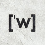
.svg)

 ). Thryduulf (en.wikt,en.wp,commons) 07:33, 26 May 2009 (UTC)


 and both the Wikispecies logo
  and the Incubator logo
  have come in for similar criticism. Put next to the others I think this logo does look quite similar


 and maybe changing the colour of the 'arms'
 would probably be enough. ☸ Moilleadóir ☎ 06:10, 31 May 2009 (UTC)


 This looks good, and one of the best I've seen so far. The solid red is a tiny too much, but the gradient red globe
  is much better. Actually the slightly thicker book part of the logo
  below is much nicer. Lantrix 09:48, 14 July 2009 (UTC)
 This one is too flat. Sorry don't like this version. Logo 2


![[4]](https://meta.wikimedia.org/wiki/File:Wiktionary-logo_entry-ar.gif)


 )? This is supposed to be an index finger... but it can be seen as a thumb. For help, Is there a designer here? I think this idea is promising. Stephane8888 21:57, 15 July 2009 (UTC)


 Commons Logo


 ). Stephane8888 07:04, 5 August 2009 (UTC)
